Creating urban positivity at The Moor, Sheffield

ST 230822 N2 hd

Contact Graeme Crow, Senior Associate Director, Branded Environments
graeme.crow@benoy.com

There’s a lot going on in the building that houses The Light cinema in Sheffield. Film, food, retail. But until very recently, people didn’t know much about it. Tasked with activating this central space, Benoy Branded Environments responded with a vibrant placemaking scheme rich in bold artwork and colour.

Benoy’s Graeme Crow, Senior Associate Director, Interior Design and Branded Environments, and typography artist Dave Towers, reflect on their collaborative effort to create a compelling, upbeat message in the heart of Sheffield.

Return to Future Thinking
Benoy Moor Walk Project Dave Towers 2

Rebuilt in the 1950s, The Moor is Sheffield’s main pedestrianised shopping centre, home to an array of tenant retailers and restaurants. The Light cinema complex, with its adjacent F&B offerings, is a major feature of the quarter. Building landlord NewRiver REIT, with support from investors PIMCO, wanted to bring this space to life and create a meaningful new destination for the city. 

Challenged to devise a placemaking solution for this central urban asset, Benoy Branded Environments undertook a rigorous assessment of the building and surrounding public realm, as Graeme Crow explains:

We quickly saw that it simply wasn’t clear to anyone passing by what was in the building or why you would enter it. There’s always been loads going on inside, but the offer wasn’t obvious and the entrances were hidden and hard to find. At the same time, we saw that the building has an interesting cut-through. With big escalators on one side and new public realm on the other, we soon realised that we needed to address the issues from two angles: a combination of wayfinding and placemaking.”

First, the team addressed the navigational aspects of the scheme, believing that in order to create a destination, they needed to conceive a name. After brief deliberation, they settled on Moor Walk, which aims to encourage access to the building and the space within. Internally illuminated, 350-mm-high aluminium lettering would spell out the name above each entrance, creating a highly visible destination and meeting point for pedestrians. The team also created backlit wall-mounted tenant boards to highlight the internal retail and F&B offerings, as Graeme reflects:


Benoy Moor Walk Project Dave Towers 2

We wanted to draw people in with the lettering, then use the tenant boards to increase the retailers’ exposure at street level. The central premise was, let’s help people understand what’s on offer inside’. Only by guiding them to this point, enhancing the navigation and destination appeal, could we entice them over the threshold.”

Next, to truly bring the space to life, Benoy Branded Environments sought a creative activation strategy that would inject dynamism, excitement and colour into the project. And for this, they sought the help of graphic artist and typography specialist, Dave Towers. Sheffield has a history of embracing vibrant and colourful street art, with multiple examples of high-impact, large-scale floor and wall art interventions around the city centre. Dave’s work, says Graeme, seemed to align with this tradition and promised to bring a colourful, optimistic dimension to the project:

Dave works with wide-nibbed graffiti pens that come in three different widths. He creates letter forms using really bright, bold colours, often with a rich distorted texture. And with his tongue-in-cheek phrasing he brings a sense of energy and fun, which we thought would be perfect for this intervention. We also felt that the raw textural quality of Dave’s work, his almost mechanical typographic forms, would resonate with Sheffield’s industrial past. His style certainly fits with that modernist aesthetic that defines The Moor’s mid-20th century architecture.”

Benoy Moor Walk Project Dave Towers 1

Onwards & upwards

Graeme and his team worked with Dave to explore different letterforms and phrasing for the available space. They landed on the phrase onwards & upwards’, which conveys both the upward motion of the escalator and a sense of urban renewal. It was, says Graeme, a deliberate acknowledgement of the hard times that many town centres have faced over recent years; in our messaging, design and colour, we wanted to create a bright, brilliant counterpoint to that.” 

As is typical of Dave’s work, the word upwards’ is presented in tumbling letterforms, which appear to be falling backwards down the Moor Walk escalator. This signature element of graphic wit, plus the warmth and playfulness of the typographic design, is intended to make the artwork more accessible and human, as Dave explains: 

I wanted to create something that people could gravitate towards. It needed to feel instinctive, imperfect and warm, and not take itself too seriously. But above all I wanted to capture the upbeat spirit of the message and the project as a whole. It was during the second summer of lockdown that I was first approached by Benoy, and the need to produce something uplifting felt really important.”

Benoy Moor Walk Project Dave Towers 3

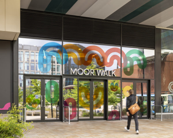
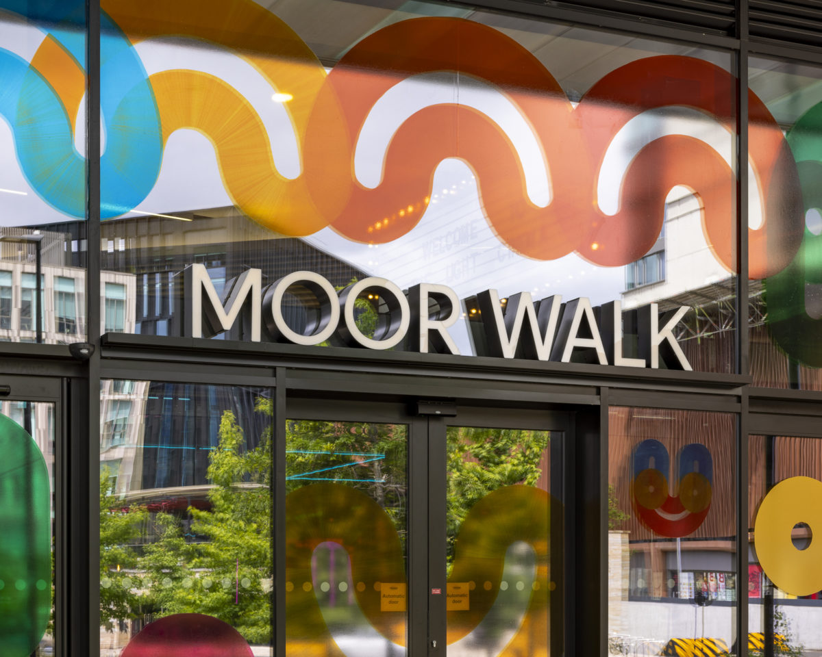
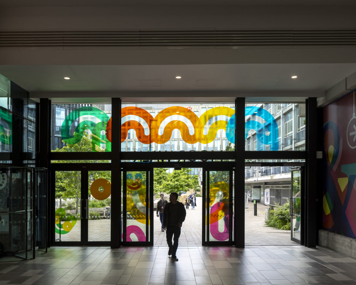
It was also the scale of the project that attracted Dave, presenting a unique opportunity to do something huge” and create a large, abstract graphic interpretation of a public space. With the letterforms painted two-and-a-half meters high on canvas, scanned to scale and printed, it was, he says, a great way to express the technique”, and the first time his work has been reproduced digitally in this way. Dave also created large smiley face icons, a pair of eyes and an array of playful shapes to enhance the building’s façade.

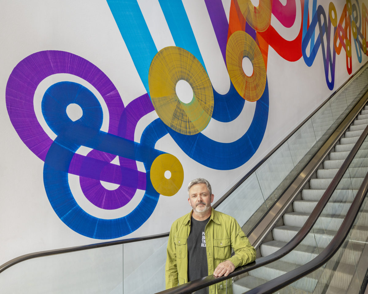
Working in close collaboration, Dave and the Branded Environments team developed a bright, neon acrylic colour palette, while exploring various ways of capturing the texture and imperfections of ink on vinyl:

There was an honesty to the approach,” says Dave. Magnifying the rough textures and imperfect lines gives a sense of life and energy, which, combined with the wit and playfulness of the design, seemed to chime with the artistic expression and attitude of Sheffield. We also discussed how certain print finishes might be reflective of the local environment, with visual references to metal and machinery that touch on the city’s industrial past.” 

With the Moor Walk artwork applied and unveiled, the project is now live, compelling pedestrians and passersby to stop, look and step inside. In particular, the giant tumbling letterforms present a resonant visual spectacle for Sheffield’s shoppers. Onwards & upwards is a great message,” says Dave, but in our design the words fall apart and fall down; but that’s life, isn’t it? You fall down, you get up, you go again. I like the optimism of that.”

Benoy Moor Walk Project Dave Towers 6
Benoy Moor Walk Project Dave Towers 2
Benoy Moor Walk Project Dave Towers 1
Benoy Moor Walk Project Dave Towers 3
Benoy Moor Walk Project Dave Towers 6