Paint it Black: Creating the ultimate customer engagement experience

Paola Marques 2 retouch edit

Contact Paola Marques, Head of North America
paola.marques@benoy.com

In 2019, Benoy North America were appointed to help create a flagship Rolling Stones store on a landmark corner of Carnaby Street in London. Combining retrospective and new perspective on this iconic global brand, the team’s designs sought to celebrate The Rolling Stones’s legacy while engaging the next generation of fans.

Paola Marques, Head of North America, distils the key lessons learned from the project and provides top tips for creating an immersive and memorable retail experience.

Return to Future Thinking
261 4 H4 A1511 Gavsy Media
246 4 H4 A1392 Gavsy Media

The Rolling Stones brand is one of the coolest and most recognised brands in the world, with a far-reaching presence and deep archive of storytelling assets. One of our key project challenges was to design a store that would be authentic and respectful to this iconic brand, while staying true to our retail principles of prioritising experience over commodity. We also had to navigate the constraints of a small historic building, plus the strictures of the Covid pandemic, with a team scattered across time-zones and limited access to the central London site. 

Our overall aim was to celebrate the band’s legacy with a vintage vibe and concert-going cultural references. These would be key to engaging loyal older fans. At the same time, we wanted to appeal to younger and emerging global audiences through interactive, cutting-edge retail tech. In this way, we sought to create an immersive and meaningful Rolling Stones experience that would capture the energy and excitement of fans, the history of the brand, and the uniqueness of exclusive merchandise. At the heart of this approach, we aimed to create a multiuse space that could serve as a gallery, fan zone, event space and on-stage experience, all under one roof. 

Here’s how we did it.

RS Store front Design

1. Storefront design: maximising curb appeal

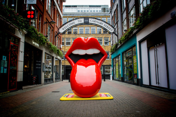
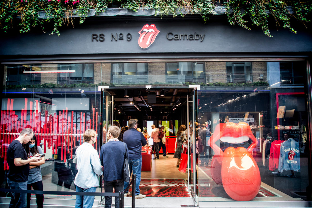
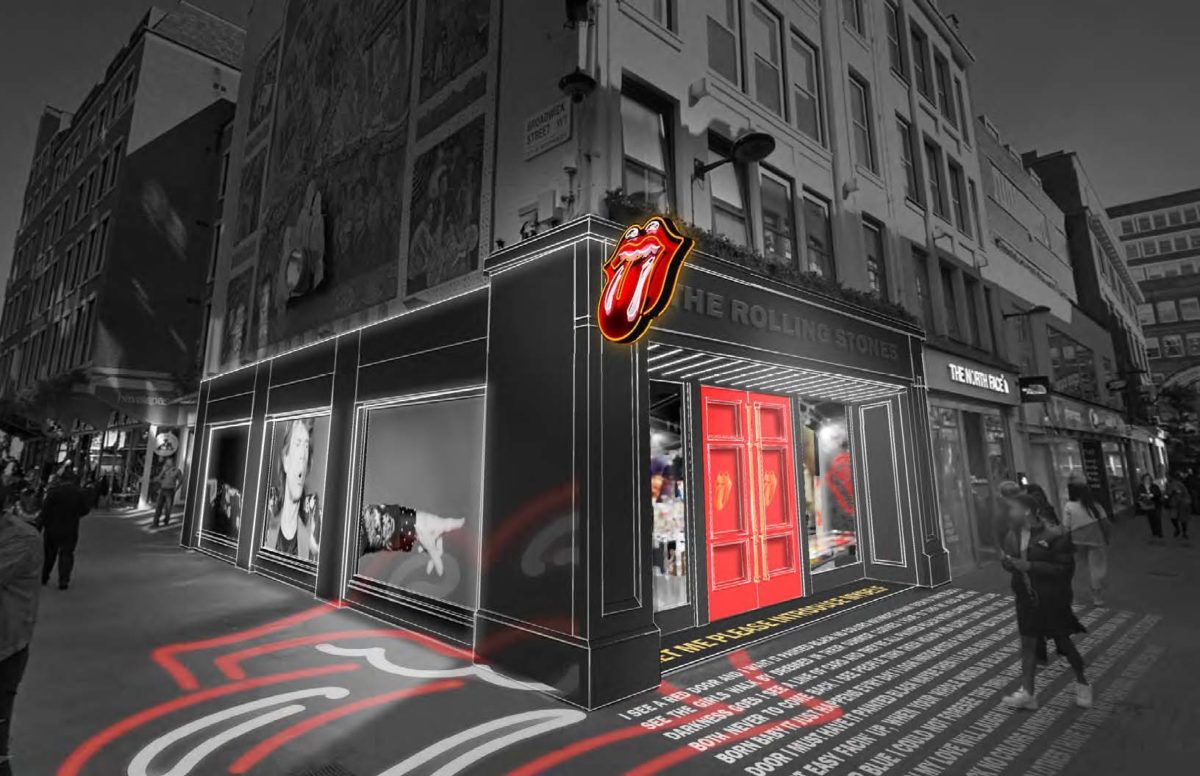
Working with a prime corner location on Carnaby Street, we were intentionally minimalist in our storefront design. Looking to maximise curb appeal, we invoked the song Paint it Black, creating a simple black façade combined with vibrant Rolling Stones Red and the band’s iconic logo, plus storefront signage that is the epitome of elegant simplicity: RS No 9 Carnaby’. We also created a metal sound wave sculpture, visualising the Paint it Black audio pattern. The sculpture runs along the front and side windows, enveloping the store in the music of The Rolling Stones.

Paring back our designs for the building’s exterior, we retained the original glazing to enable passersby to see through to the back of the store. The idea was to provide full transparency, with merchandise, video screens and a large 3D version of the tongue and lips’ logo on display to pique curiosity. The result is a clear, simple and striking storefront that presents multiple photo opportunities and compels people over the threshold. 

Groundfloor 2

2. Design inspiration: exploring materials, colour schemes, album artwork and lyrics

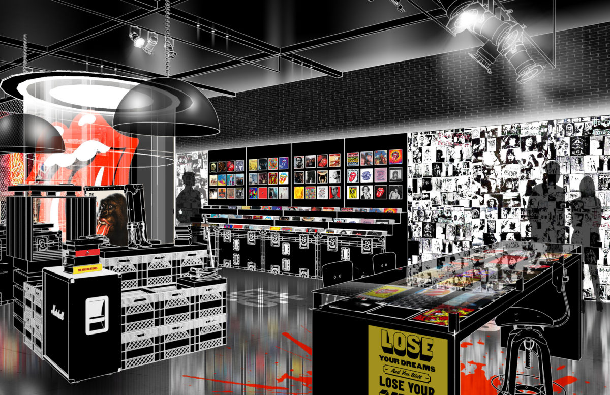
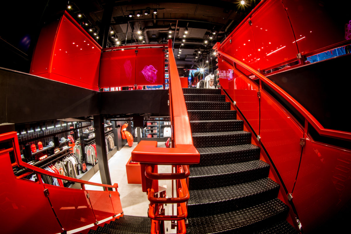
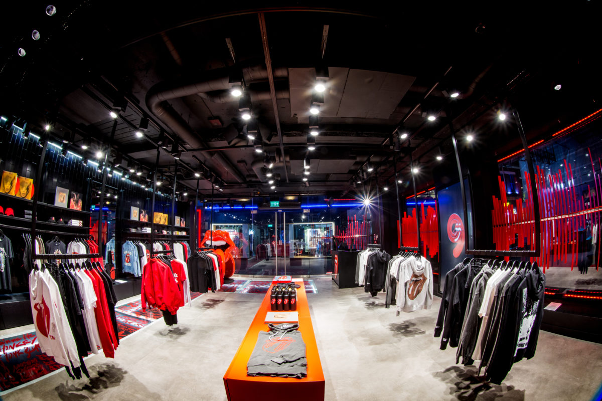
The store’s interior had to speak the language of The Rolling Stones and tell a compelling brand story. Against black walls and ceiling, we used Rolling Stones Red as the predominant colour on panels, graphic devices and central display bars. This creates a simple but powerful visual spectacle that immerses consumers in the brand colour scheme. Red banisters and gloss glass also reflect the light and draw the eye to the store’s staircase, guiding customers to the lower level. 

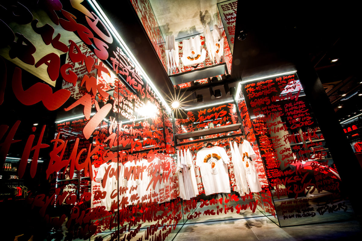
Underfoot, we opted for large format porcelain and concrete flooring, stripping the design back to create a bare stage space. We also utilised areas of glass flooring to layer in song lyrics and provide glimpses of the space below. The overall effect creates a rich sensory experience, with consumers surrounded by the raw creative energy and essence of The Rolling Stones. 

186 2 Q6 A7983 gavsymedia

3. Lighting design: creating a vibrant and vintage vibe

To maximise the vibrancy of the instore colour scheme, we worked with an external lighting designer and lighting engineer. Their principal task was to bring the Rolling Stones Red to life through specific lighting positions and tones. For example, by exploring different angles above and below the sound wave, they were able to enhance the sculpture, using strategically located lighting trays to make the metal rods glow, with a view to engaging consumers. 

Elsewhere, we added lighting to create an enticing ambiance at the top of the staircase, encouraging movement between the floors. Overhead spot lights’ also reinforced the concept of an immersive event and stage space, while more generally the lighting designs serve to enhance the merchandise.

4. Technology: engaging younger consumers

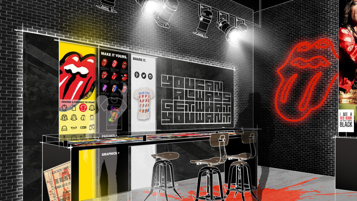
One of our key objectives was to combine an irreverent, retro allure with a modern retail experience enhanced by instore tech. In particular, we wanted to encourage personalised interactions with Rolling Stones merchandise, devising digital customisation zones that would enable fans to print their own T‑shirts and customise products. These technological innovations allowed us to position the instore merchandise as both exclusive and accessible, giving customers a greater sense of brand proximity and ownership. 

Our team of engineers focused on upgrading the mechanical and electrical system to support the elevated concept and bring the space to life. We also strategically designed the space with a black and neutral background and used lighting to evoke a sense of theatre’. Meanwhile, multiple screens, displaying Rolling Stones tour content, helped to create a digital stage’. 

RS Store Technology

5. Reclaiming space: bringing the album experience to life

On both levels, we leveraged previously unused recesses and cubby spaces to create a series of unique rooms. Our aim here was to take the albums into the fitting areas, covering the changing room walls with album artwork from Exile on Main Street and Some Girls. 

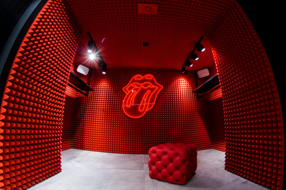
Using intentionally contrasting materials, we reclaimed a small area in the lower level and recreated a sound room/​recording studio to display exclusive merchandise – another great opportunity for a selfie! Elsewhere, we used loud, flashy glass and mirrors to conjure the glare and noise’ of an on-stage environment. Overall, our fitting room concepts further immersed consumers in the world of The Rolling Stones, with album motifs either reaffirming longstanding fan loyalties or introducing younger shoppers to new visual experiences. Mobile point-of-sale facilities were also located near each fitting room, enabling quick and easy transactions.

102 4 H4 A1075 Gavsy Media

6. Product display: curating collectible items

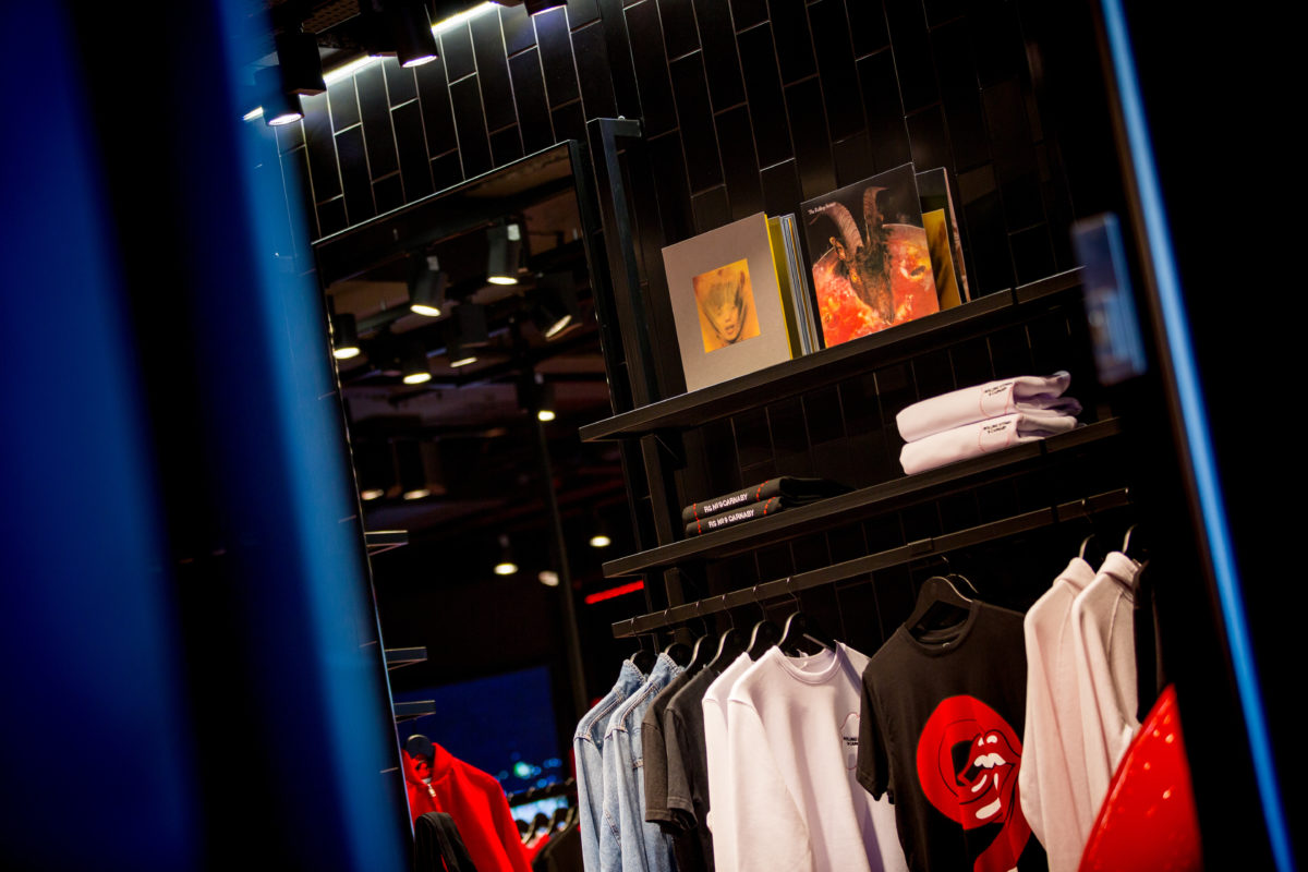
RS No 9 Carnaby enables customers to shop exclusive and limited edition Rolling Stones merchandise. By taking a curated collectibles’ approach, we devised a product display system that encourages people to shop by era’. This involved using retrospective galleries and wall art, with products arranged according to their links to specific albums or key periods in the band’s history. 

We also conceived an innovative merchandising system that includes a flexible perimeter hanging fixture and storage facility. This key feature enables merchandise to be removed or relocated as required for specific events and exhibitions. Upstairs and down, we installed central red storage plinths to display key products and accessories – a simple but strong design gesture which guides customers’ line of sight. And wherever possible we notched into available spaces and introduced adjustable shelving to maximise merchandise volumes. 

107 2 Q6 A0192 Gavsy Media

7. Upstairs downstairs: providing unique layout and instore activation

Working within the confines of an historic building, we sought to make strong distinctions between the store’s upper and lower levels. While upstairs is all energy and light, downstairs we created an intimate lounge-vibe that is gritty, dark and vintage, yet also flamboyantly modern. To activate the senses, we evoked the atmosphere of an undercover venue, complete with black wood fittings, exposed low-ceiling structures and another large 3D Rolling Stones logo. Hinting at backstage roadie chic’, the space provides a sense of unique access, both to exclusive products and behind-the-scenes operations, delivering the ultimate customer engagement experience.

To link the two floors, we added glass panels to the existing staircase, giving it more weight and impact (previously there was just a metal rail). We also designed lighting to sit under the glass floor and draw attention to the lower level. Our aim was to reassure customers and invite them to descend, enabling seamless movement between the two levels.

129 4 H4 A0959 Gavsy Media

8. Design strategy: creating a multiuse space

Our design strategy was to deliver a multiuse space that would be a part gallery, fan zone, event space, retail and on-stage experience. A space that would encourage fans old and new to engage with the brand. We therefore intentionally created digital and analogue opportunities to allow all generations to live their emotional experience of The Rolling Stones. 

We embraced the site conditions and client requirements, and met these challenges by prioritising brand expression, focusing on the customer experience from the street front to the basement level. Overall, our strategic approach involved creating a designed environment whose simplicity showcases the brand and merchandise and supports a seamless customer journey. 

214 4 H4 A1051 Gavsy Media
246 4 H4 A1392 Gavsy Media
RS Store front Design
Groundfloor 2
186 2 Q6 A7983 gavsymedia
RS Store Technology
102 4 H4 A1075 Gavsy Media
107 2 Q6 A0192 Gavsy Media
129 4 H4 A0959 Gavsy Media
214 4 H4 A1051 Gavsy Media