Emily Whiteside, Associate Director in our Branded Environments team, reflects on how we can improve sustainability in wayfinding and presents a flow chart that assesses a design concept against four key principles.
Return to Future ThinkingWhat makes wayfinding sustainable?
In the world of wayfinding, people typically imagine that to mean a sign – a panel of some material or another, layered with directional information, an outdated pictogram of a man and a woman (have you ever worn a dress like that?) and a (hopefully) legible and well considered choice of typeface.
Of course this is an oversimplification of what wayfinding is. Nevertheless, there usually is a physical product going into manufacture and, like with any product, that means natural resources being consumed, greenhouse gases being emitted and landfills being filled. “Who needs signs anyway?” I hear you cry, “have you heard of Google?”.
And while digital wayfinding can be an innovative solution, in my opinion there is still a place for the humble sign. For those who aren’t tech savvy. For amplifying an expression of place. For reducing a sea of paper print-outs warning you that you are, in fact, going in the wrong direction.
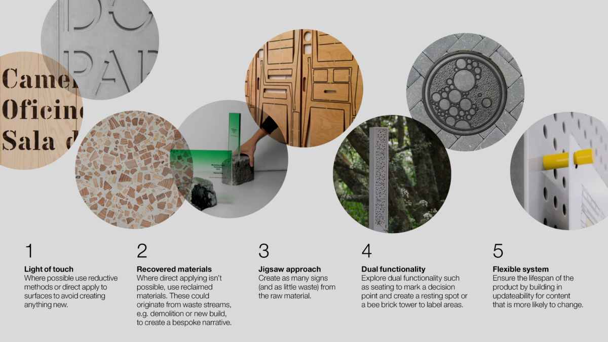
With this in mind — and inspired by my informative teenage years of magazine quizzes — I developed a flowchart that suggests ways to make your design more sustainable. It doesn’t design the sign for you, as every wayfinding system should be bespoke to the place, but it does step you through a series of thought provoking questions. Think of
a sign, any sign; Does it need to be there? What’s it made from? Does it have any other purpose? And at the end, instead of predicting your teenage crush, it assesses your design concept against four key principles.
- Light of touch. Where possible use reductive methods or direct apply to the surface to avoid creating anything new.
- Recovered materials. Where direct applying isn’t possible, use sustainable reclaimed materials. These could originate from the demolition or build, with the added benefit of being local, reducing other waste streams and creating a bespoke narrative.
- Jigsaw approach. Create as many signs (and as little waste) from the raw material. If your chosen material comes in a standard sheet size, then play Tetris and design your panels to maximise the number signs you’ll get from a single piece.
- Enhance the environment. Explore dual functionality, such as seating to mark a decision point while creating a resting spot or integrating into wildlife havens like a bee brick (a sign that can save the bees!).
By no means does this provide a definitive answer to the question “what makes wayfinding sustainable?”. The flow chart doesn’t cover the products’ end-of-life. Nor does it mention public art acting as unconventional wayfinding by drawing people to a space, or the advantages of a tone of voice that can influence behaviour change (take the stairs and save a lift load of carbon). Besides, have you ever considered whether your choice of typeface could save ink? Spoiler. It probably can’t, unless you’re designing a phone book and Google has fixed that one.
So, it’s maybe not the solution. But it is a start.


