Qin Pang, Director and Head of Benoy’s Shanghai Studio, discusses the design of The New Bund World Trade Center (Phase I), Shanghai in his role as Chief Architect on the project.
What is the central idea behind the project’s design?
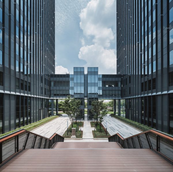
Qin Pang: The architectural design of The New Bund World Trade Center (Phase I) is a continuation of the masterplan for Lujiazui Qiantan Business District. It corroborates the masterplan at the building scale. The multi-layer urban pedestrian system, interlocking network of business spaces, and continuity of the urban presence all add to the diversity of the urban complex, resulting in an improved user experience and sense of public space. The design enables the development to maximize its commercial success.
Benoy has worked with Lujiazui Group on several projects in the past. What are the implications of this particular project for Lujiazui Group and the Qiantan development as a whole?
QP: This project is different from all the previous developments because it is the first project in which Lujiazui Group itself is the investor in the Qiantan area. As the first landmark you see on Jiyang Road, it sets the overall tone of the Qiantan development, so it is very important for the project owner and Qiantan area as well.
The site is set in a commercial area, how does the development set itself apart architecturally?
QP: One of our design principles is to fully combine functionality with flexibility, so that the complex can be used for various businesses ranging from office and retail to catering services. This helps optimise the commercial utility of the buildings. The buildings feature rectilinear elements and blocks as the core architectural language, which explains its crisp and clean look.
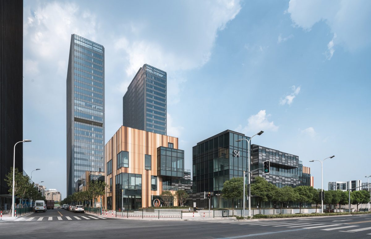
The façades showcase a rich colour texture that combines cold and warm colours of varying grayscales and lightness. It adds individuality to spatial divisions without undermining the architectural integrity, inspiring a different visual imagination among different users. While maintaining a high window-to-wall ratio, we made small gaps between the vertical louvers so that they become parallel lines when viewed from the side. These details bring great subtlety to the work without incurring any additional costs.
The development includes the twin towers and seven stand-alone podiums. What makes the layout different from other projects?
QP: What makes the design unique is the fact that we split a large, not overly tall tower block into two, creating two off-centre tubes standing close to each other at the east end of the site. Space for the seven shorter stand-alone podiums to the west is maximised to create a network of internal business facilities. The spatial richness and user experience are optimised as a result.
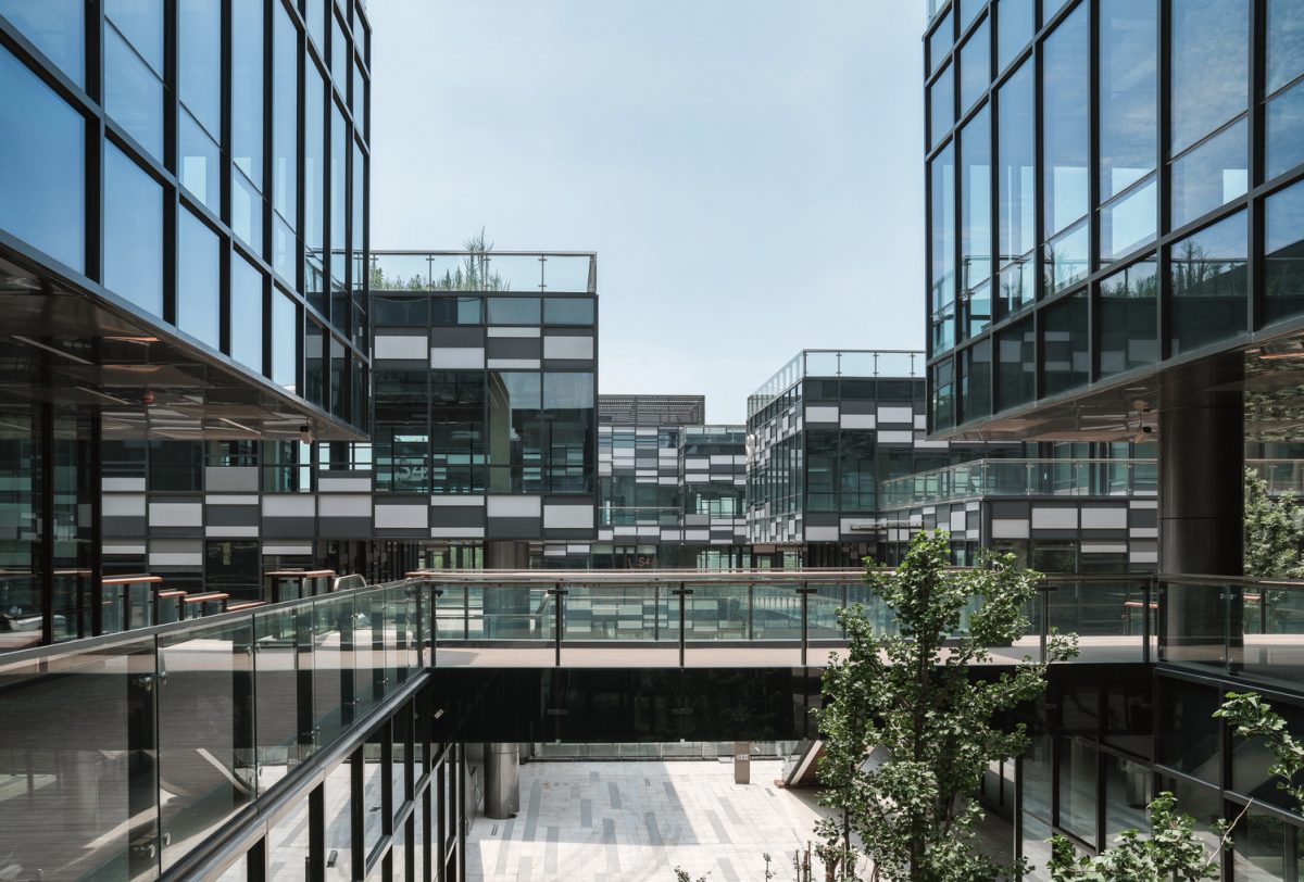
We decided to build a commercial street because we knew that one or two large shopping complexes would be built in Qiantan, and they were much bigger than the World Trade Centre. The street encourages diversity and sets the development apart from other complexes in the area. Bridges have been introduced on the second level to connect the office towers. This allows commerce to flow into the office buildings, and increases the use of the second level by the office workers. The design will help retailers in the buildings attract more customers.
After completing the masterplan, architectural design and interior design of The New Bund World Trade Center (Phase I), in your opinion, what are the strengths of the project?
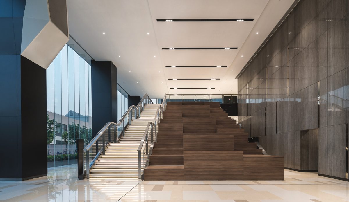
QP: Benoy provided the entire design solution for the project, from the Masterplan all the way through to the Architecture, Interior and Graphic Design. The complex stands out for its organic, architectural integrity.
Read more about The New Bund World Trade Center (Phase I) here.
Project Details:
Location: Qiantan, Shanghai, China
Scope:Masterplanning, Architecture, Interior and Graphic Design
Sector: Mixed-use
Client:Lujiazui Group
Site area:17,200 m2
GFA: 140,000 m2
GFA Above Ground: 95,000 m2
