Xintian 360 Plaza is an exciting development in Shanghai, offering a total of 18,400 sq m of commercial retail in the beautiful community of Kangqiao. It is located at the heart of Pudong New Area, both sides of Pudong Section of the city’s outer ring road, near Disney in the east, post-Expo in the west and Zhangjiang section of the Free Trade Zone in the north. It has a unique geographical location in the Shanghai Pudong Kangqiao Industrial Zone, an important municipal industrial park in Shanghai. The project base locates at the southwest of Kangqiao Town, near Zhoupu Town and Minhang District, 23KM and 14KM respectively away from Pudong Airport and Lujiazui, less than 10KM away from Disneyland, and can be reached directly through Xiupu Road.
The development’s four distinct activity cores, i.e. leisure, ecology, green life and creativity to create a new type of urban development. It fuses watching and being watched, online and offline, as well as experiential retail, which will attract visitors with an appreciation fashion, forward looking trends and lifestyle quality. This is the first family-experience type shopping center in Big Pudong Area that blends a fashionable metropolitan business district and an ecological and livable garden environment.
Key Interior Design Features
With deep insight of forward-looking consumption trends, Benoy understands that shopping may no longer be the main purpose of shopping centers, and that “unique experiences” are what attract and retain young, contemporary consumers. The pursuit of quality of life, immersive sensory experiences, and emotional connections and social engagement all strengthen the experiential attributes of great retail destinations.
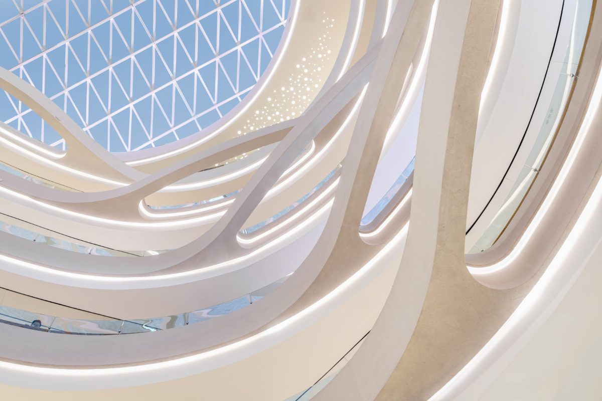
With this in mind, Benoy led the interior design of Xintian 360 Plaza from concept design, schematic design and detailed design. The design narrative reflects the positioning of “Shanghai Life+”, draws inspiration from the natural surroundings of the river and the elegant flower of Shanghai called “the white Yulan”, a natural consistent form that permeates the interior.
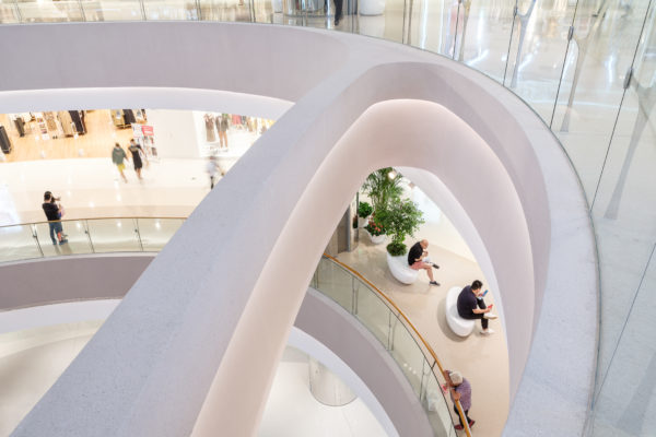
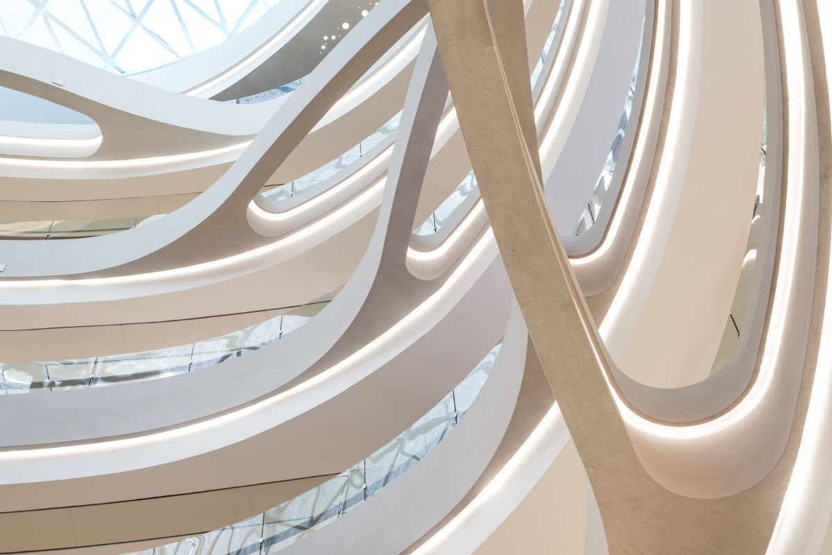
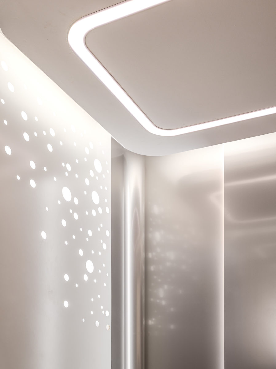
The design approach has subtle gradation in natural tone and materiality, and plays with light, colours and reflection. This aesthetic language extends to the retail planning where the void edges and the arcades also connect and reflect the aesthetic of the soft, sinuous flower.
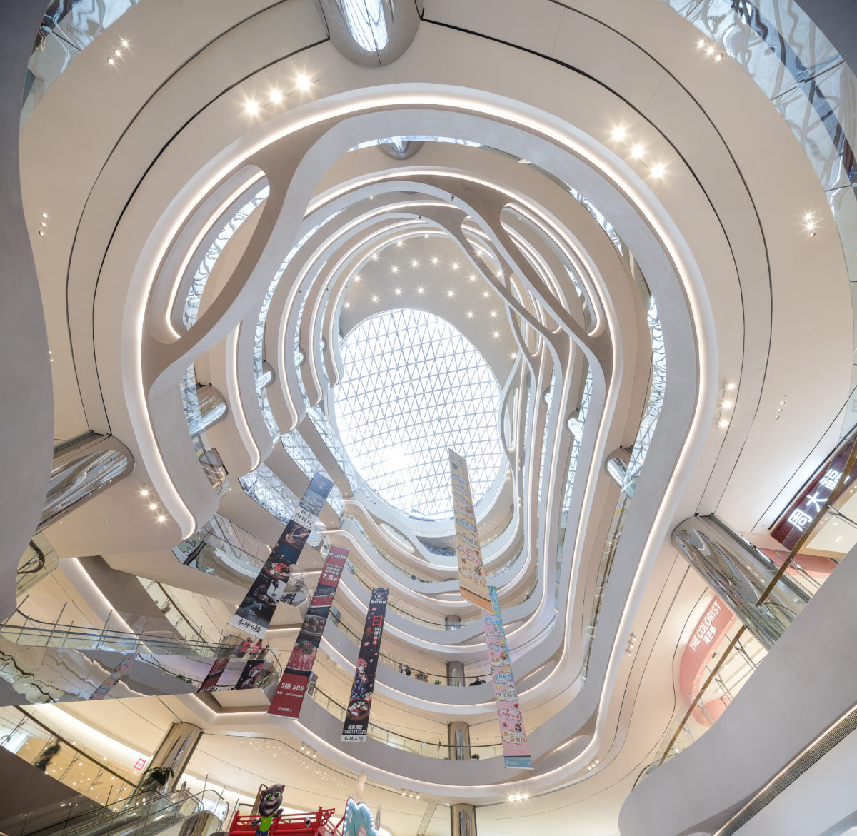
The Blossoming of the white Yulan is at the center of the concept narrative. The movement of the petals is translated into the design of the void edges and extends into the flooring design.
The gradation of natural color tones of the void edge finish which fades into white, together with the petal shape forming part of the void edge architecture, and then combined with the lighting effect creates a magnificent dynamic atmosphere in the Main Atrium.
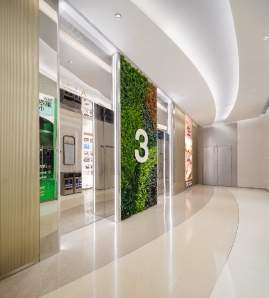
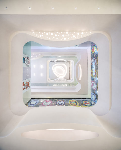
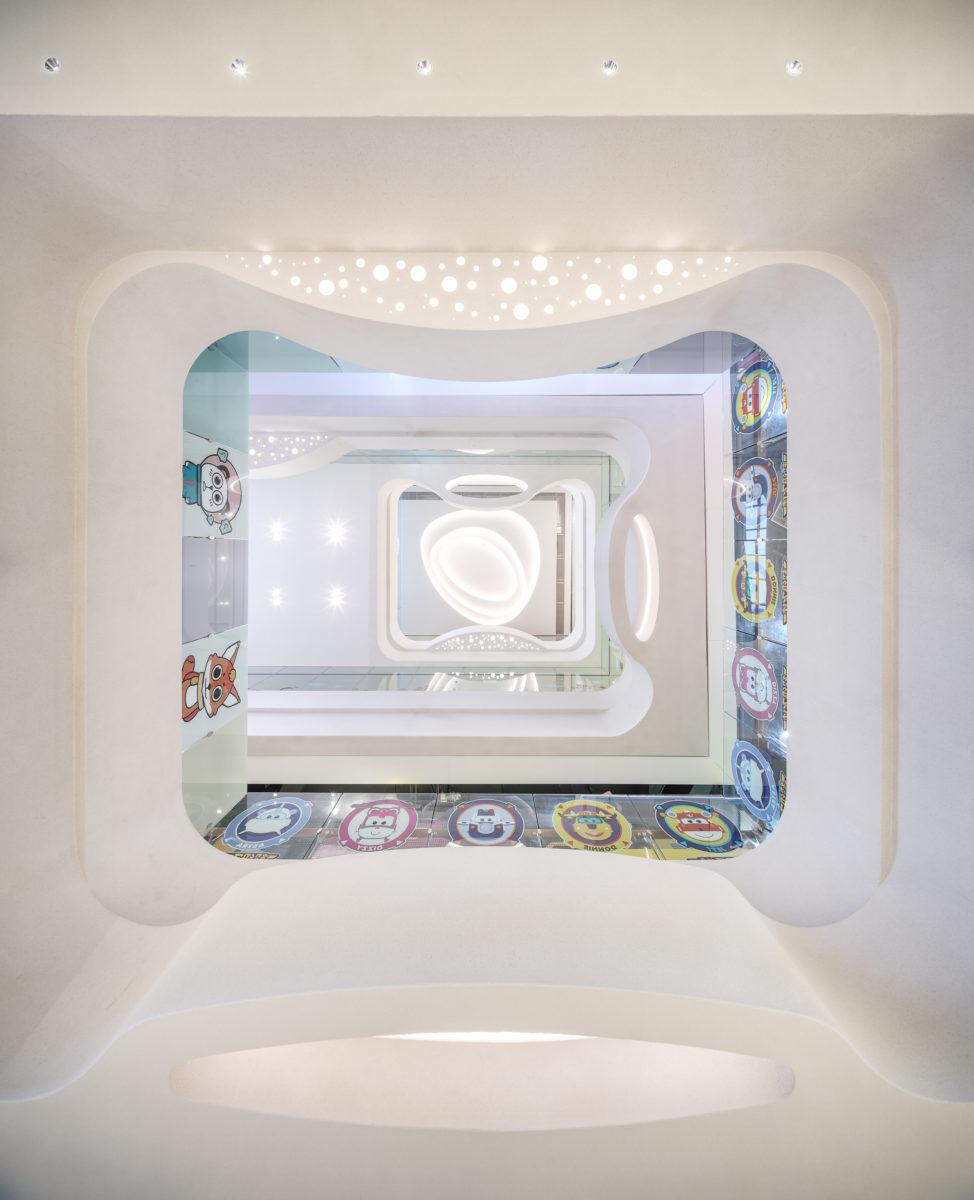
As the customer takes a journey through the shopping mall, one will experience a subtle difference in the basement which holds the main F&B area. The color tones begin with an earthy palette at the bottom and gets progressively lighter and brighter as you traverse to the upper levels. The children’s zone at L4 introduces bright colors and a playful feature ceiling in order to differentiate its form from the typical design, becoming a ‘destination with a destination’ within the mall.
The interior space is organised around an elliptical void that rises from B1 through the full height of the building. This space links the entrance from sunken plaza, the main entrance from L1, and the secondary entrances at L3 and L5, and is the key spatial orientation node of the development.
Inspired by the unfurling petals of the magnolia flower, the design team introduced a series of decorative loops that span out from the void edges and create moments of interest within the void. The colouring of the void edge also changes from floor to floor, creating a gradient from pale magnolia to deep pink that provides visual contrast and variety, and accentuates the feeling of light and space within the main volume.
The secondary circulation loop is a generous internal avenue allowing access to larger flagship stores. In order to create a sense of open flow between the main volume and the secondary loop, an area of open retail has been created, allowing visual links between the main and secondary circulation.
Materially, the design uses a restrained palette of coloured terrazzo in warm shades which match the textured paint of the void edge, together with mirror-finish stainless steel.
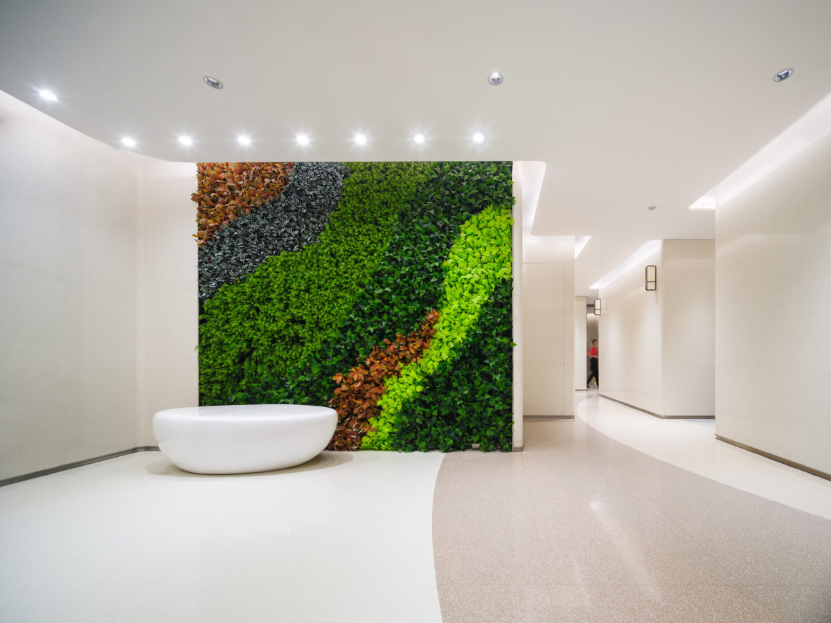
To round out the ecological and environmental theme of the development, a striking petal-shaped art sculpture at the Main Entrance and a waterfall with hanging greenery at the Secondary Entrance welcome customers to enjoy a relaxing and sophisticated journey.
Project Overview:
- Scope of Services: Interior Design
(Concept design to Construction review) - Category: Retail
- Client: Xintian 360 Group
- Total floor area:
(above/below ground if applicable): B1+L6 total 17,542 sqm
(7 floors), with basement total 18,400 sqm - Design team: Valeria Marchetti, Miree Kwon, Clare Chan, Paolo de la Cruz
