Beijing Chaoyang Joy City
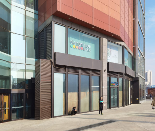
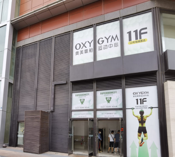
Chaoyang Joy City is located in the heart of Beijing’s Chaoqing district in the eastern part of the city. This area is known for its youthful energy, fashionable atmosphere, trendiness, and refined taste, making it a growing urban district for living, working, and recreation. However, as the city progresses and evolves, the aging exterior of Joy City no longer aligns with the dynamic and ever-changing businesses it houses. The outdated design language fails to meet operational and investment requirements, needing an urgent update to the façade design to enhance the overall quality of the shopping centre.
Current Situation and Challenges
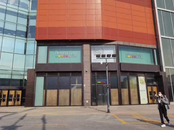
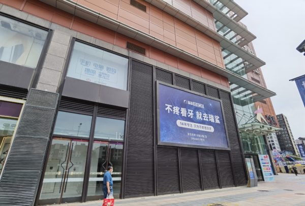
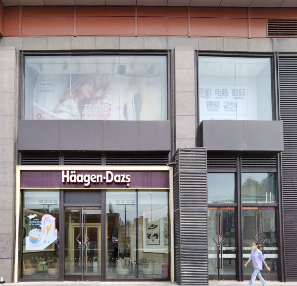
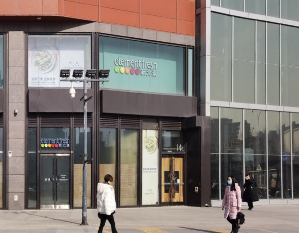
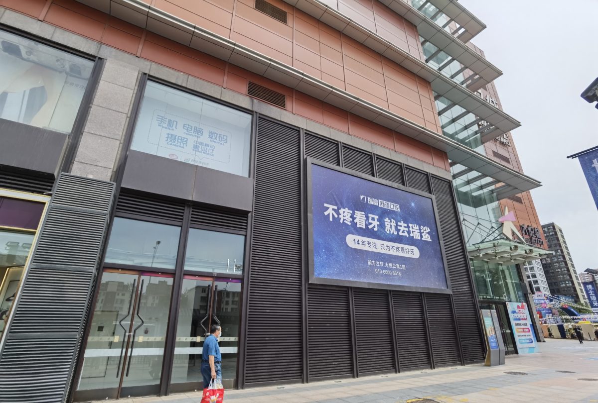
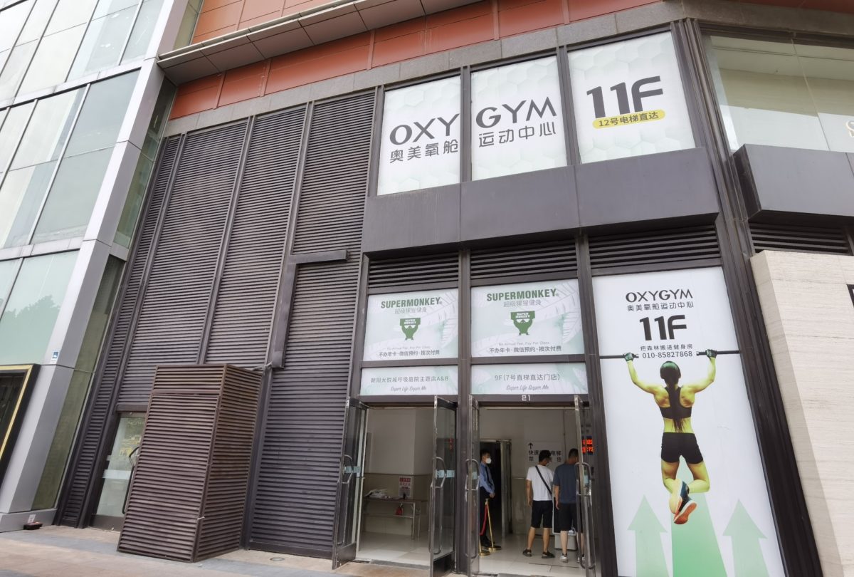
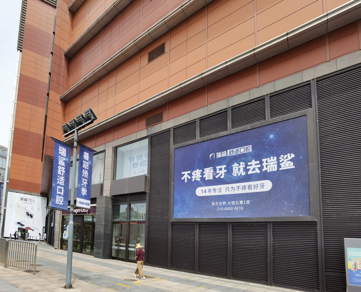
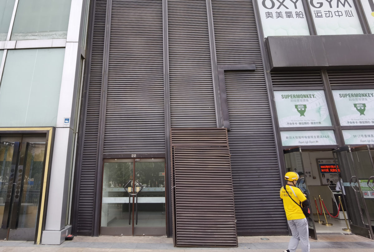
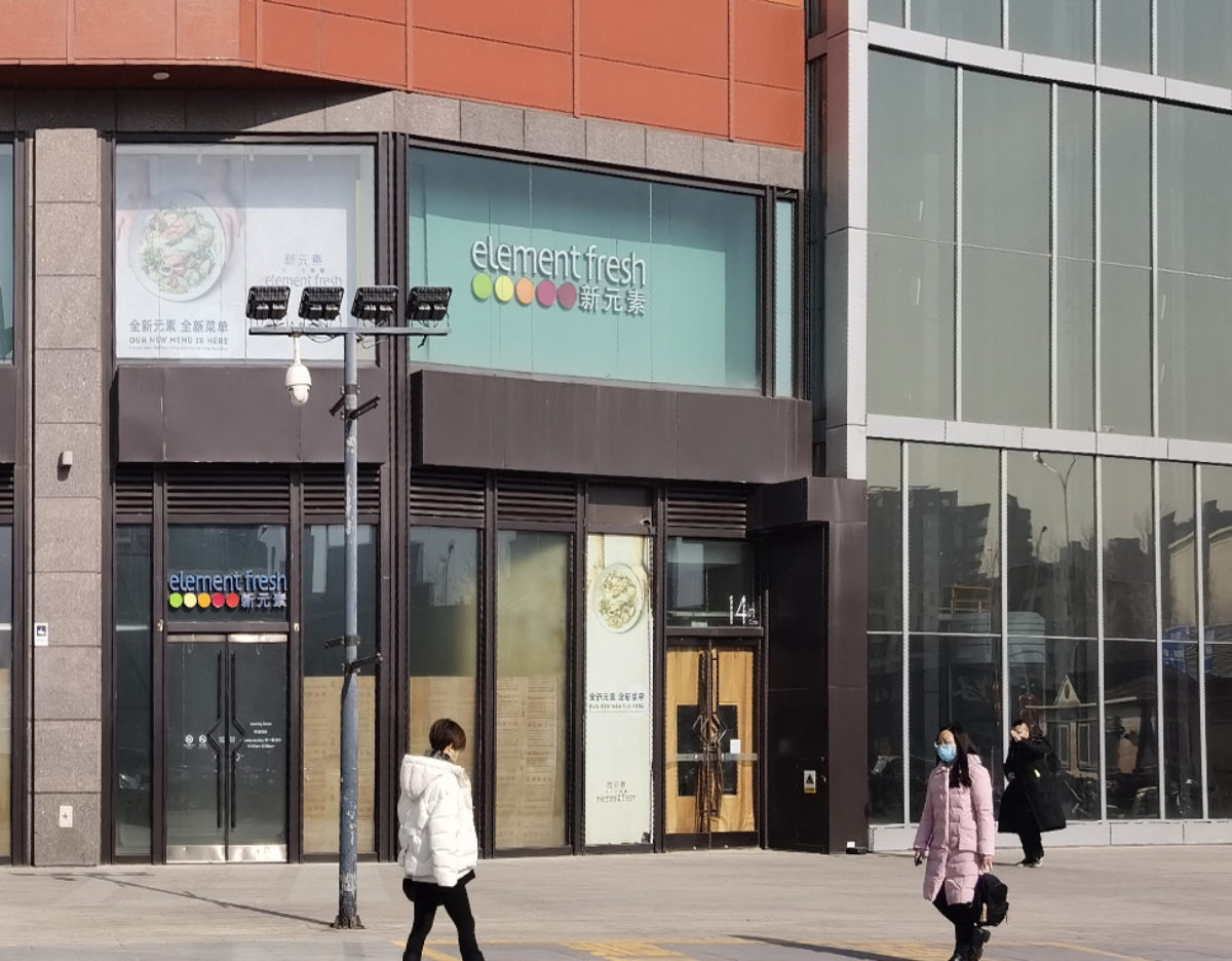
The ground floor shops along the street facing Chaoyang North Road and Qingnian Road experience a high volume of customers right at their entrance, making it crucial to create a positive first impression for visitors. However, this area previously suffered from a disorganised combination of shop advertisements, window displays, gas shafts, back doors, stairwells, and vacant units. The features and façades displayed different styles, resulting in a disorderly and low-quality appearance. With the redesign of the shopping centre’s layout, the ground floor and first floor will now focus on affordable luxury brands. Therefore, there is an urgent need to revamp the overall design to align with the new vision.
Enhancing Quality, Aesthetics, Style and Revitalisation
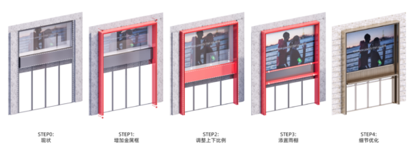
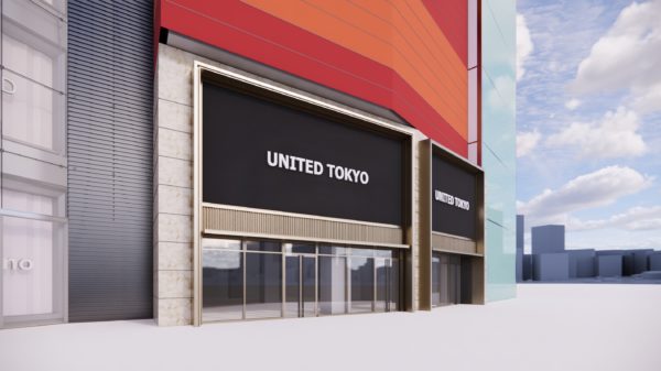
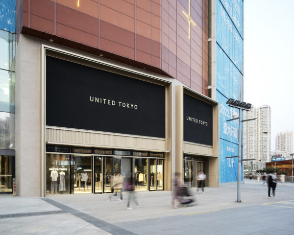
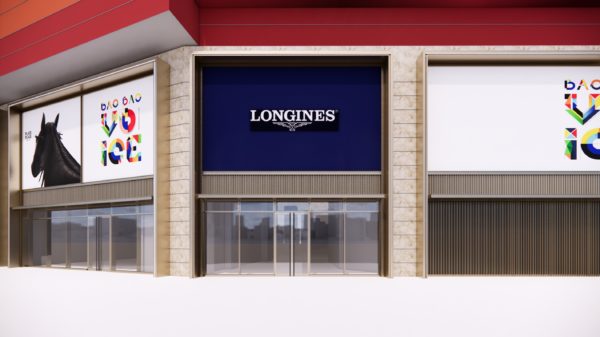
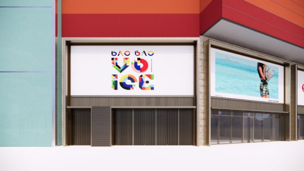
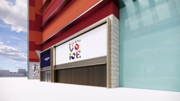
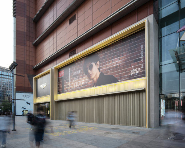
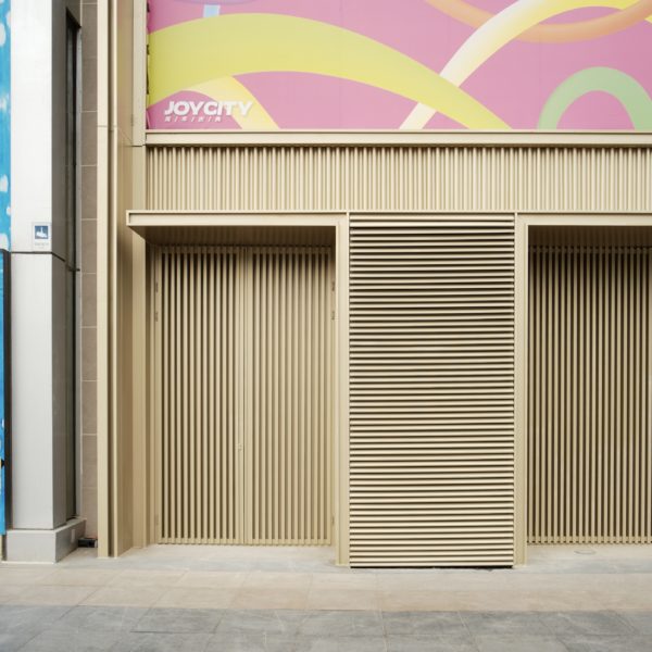
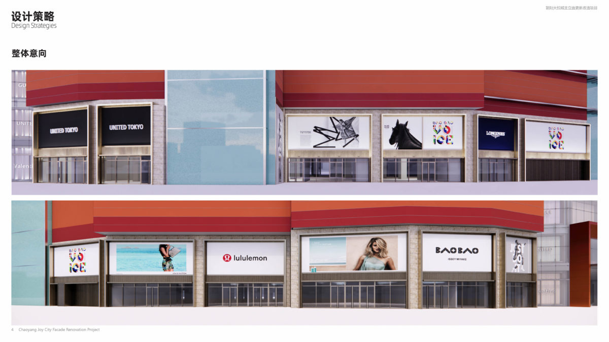
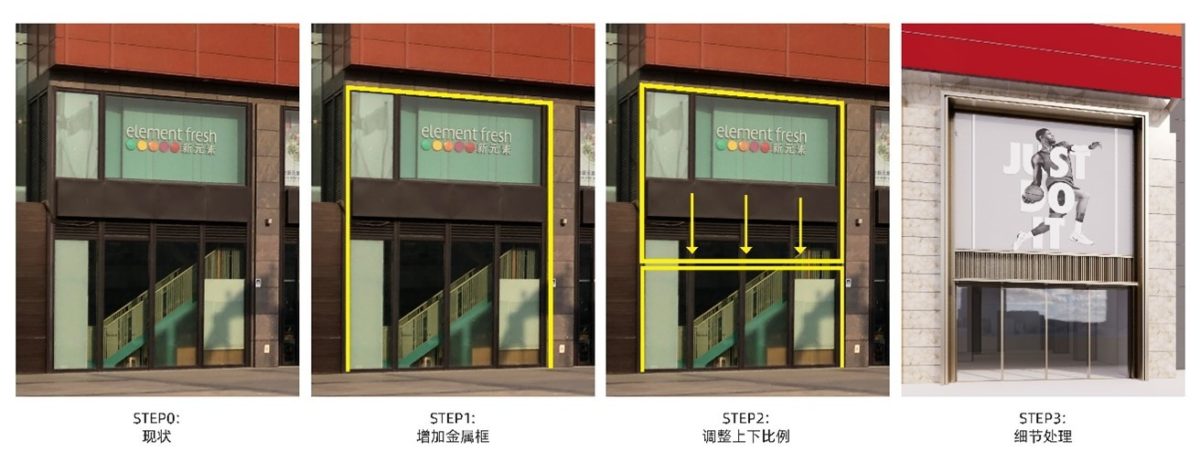
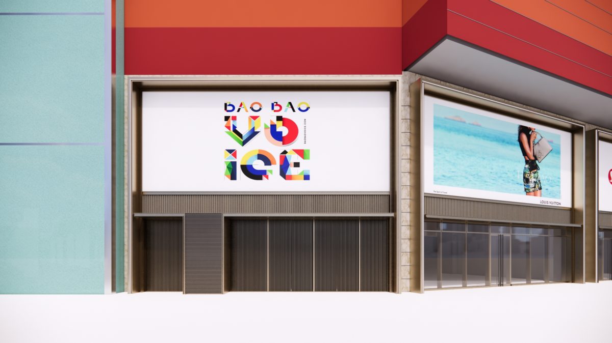
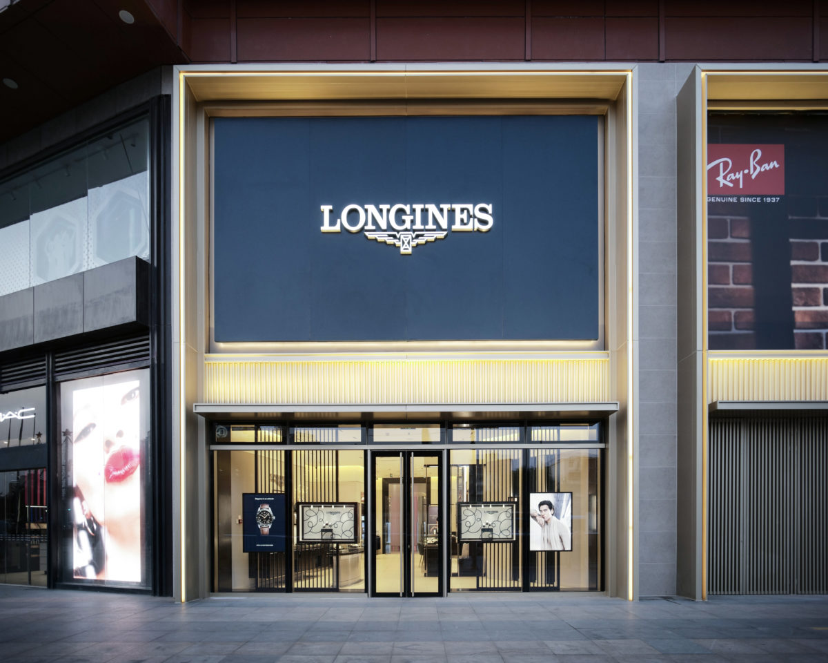
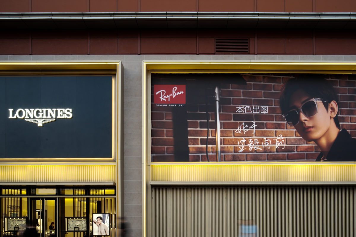
The primary objective of the renovation is to elevate the impression of the flagship arcade by strategically positioning brand units for a seamless and unified experience. The width of each “door frame” is custom-tailored to match the floor plan of the respective shop, ensuring a functional and cohesive layout. The aluminium panels on the façade are designed to protrude from the glass surface, adding depth to the units and reinforcing the door frame effect. This design element not only creates different patterns of shadows on the façade but also breaks up the flat surface.
The design preserves the original ceiling height while making specific adjustments to the proportions of the ground floor and first floor to accommodate the shop window display. This includes maximising the space for advertising and logo at the top, as well as utilising corrugated metal panels in the middle as a transitional element. Additionally, a conventional canopy has been added to provide standard installation while ensuring uninterrupted shelter for pedestrians in the plaza. The overall result of the renovated windows on the first two floors is a harmonious blend of functionality and aesthetic appeal
The Beauty of Design, the Joy of Life
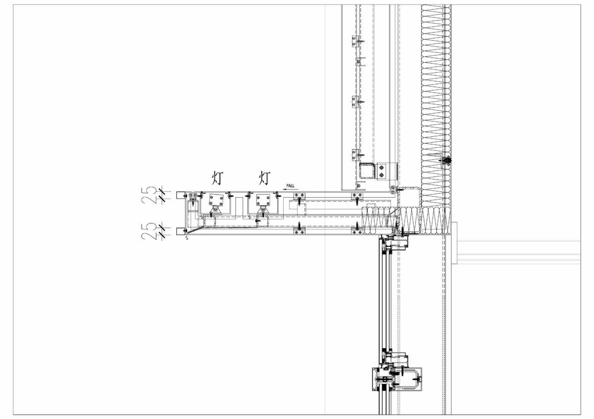
The door frame design takes into consideration the significance for night time lighting by adding metal wire feet on the exterior. This design allows for concealed lighting to remain hidden during the day while providing illumination at night.
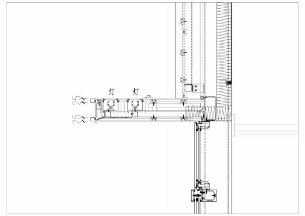
Due to constraints in the existing floor plan, the advertising space on the first floor lacks the ability to protrude or increase depth for installing internal lighting. As a solution, external lighting will be utilised to illuminate the advertising space on the first floor. The lighting fixtures are cleverly concealed within a dedicated lighting channel positioned above the canopy to avoid the typical issue of exposed external lighting.
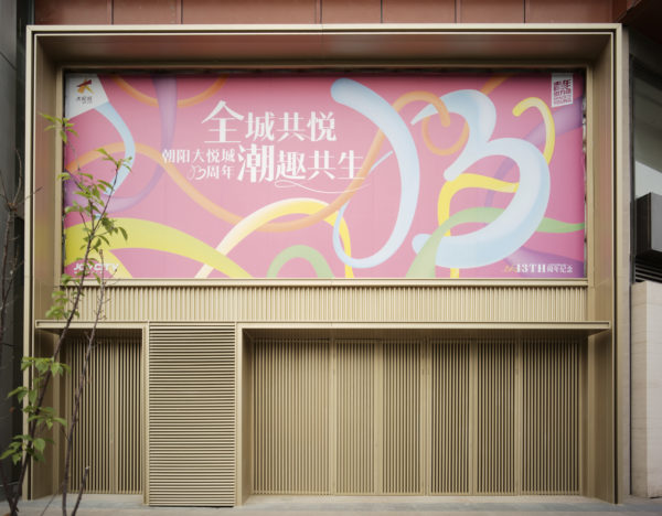
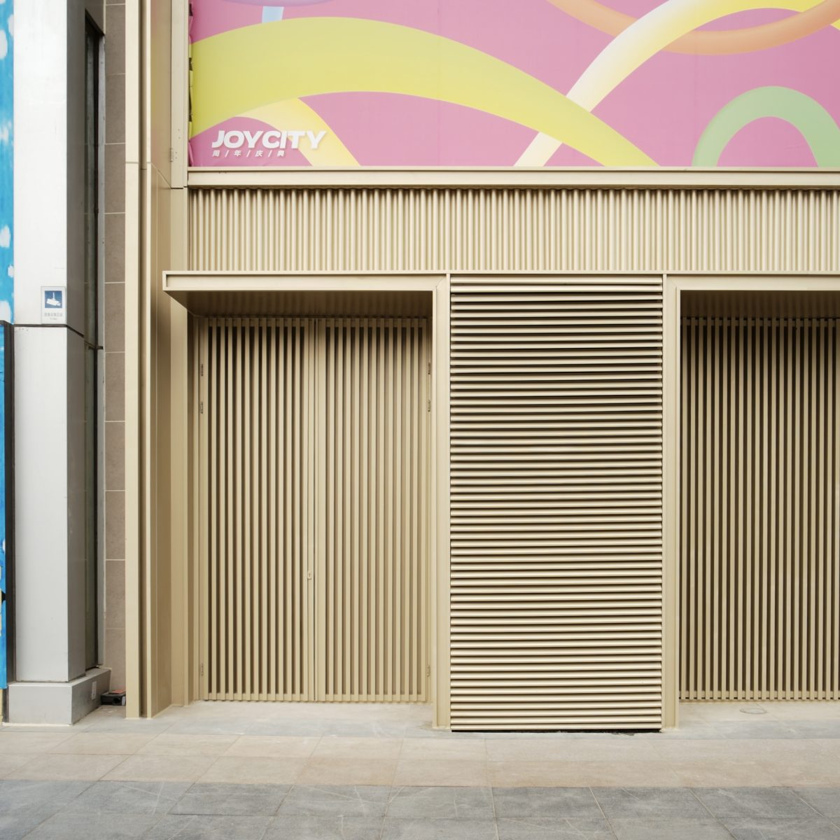
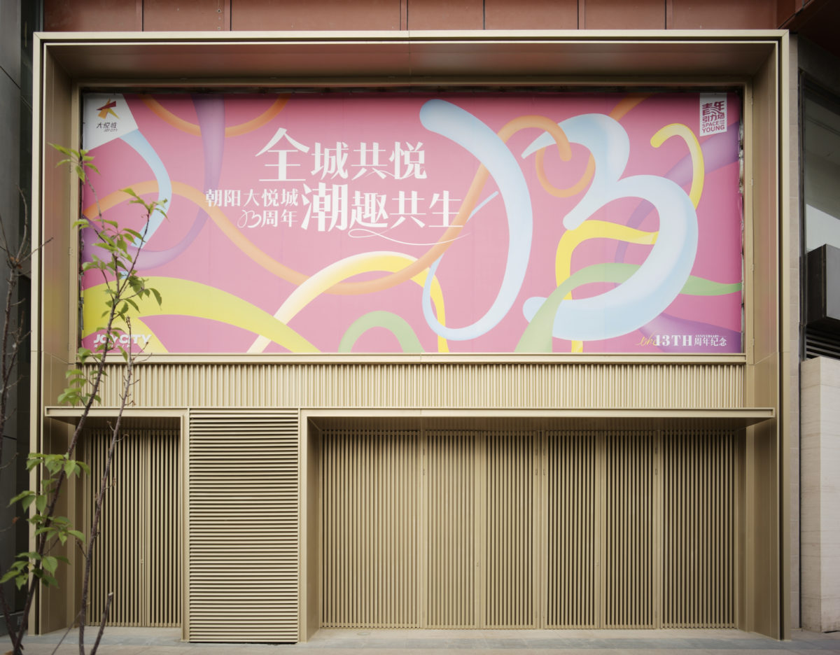
The previously exposed fan units have now been integrated into the grille panels, effectively concealing them from view. These fan units are visually distinguished from the rest of the vertical decorative grille through the use of horizontal grilles, which also provide shelter.
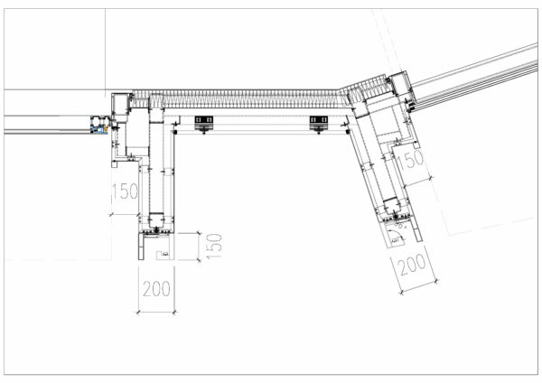
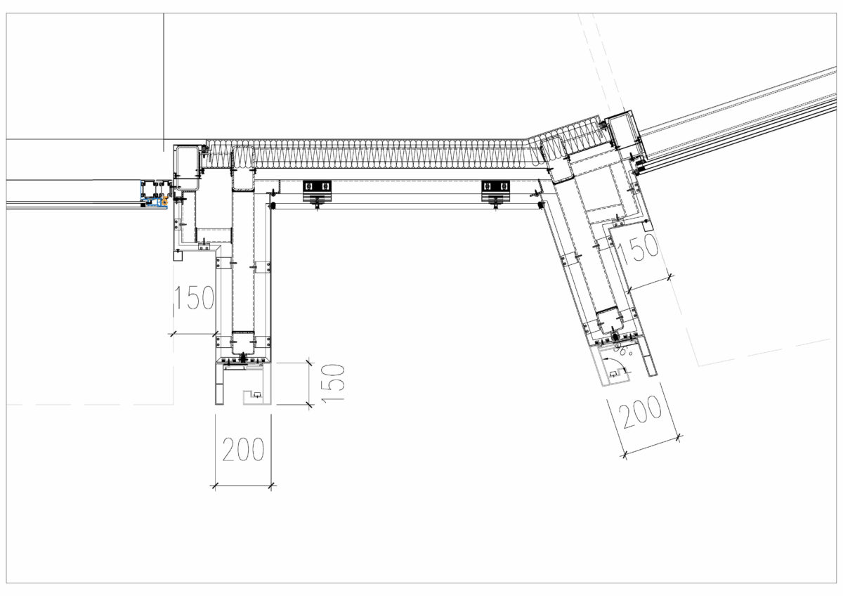
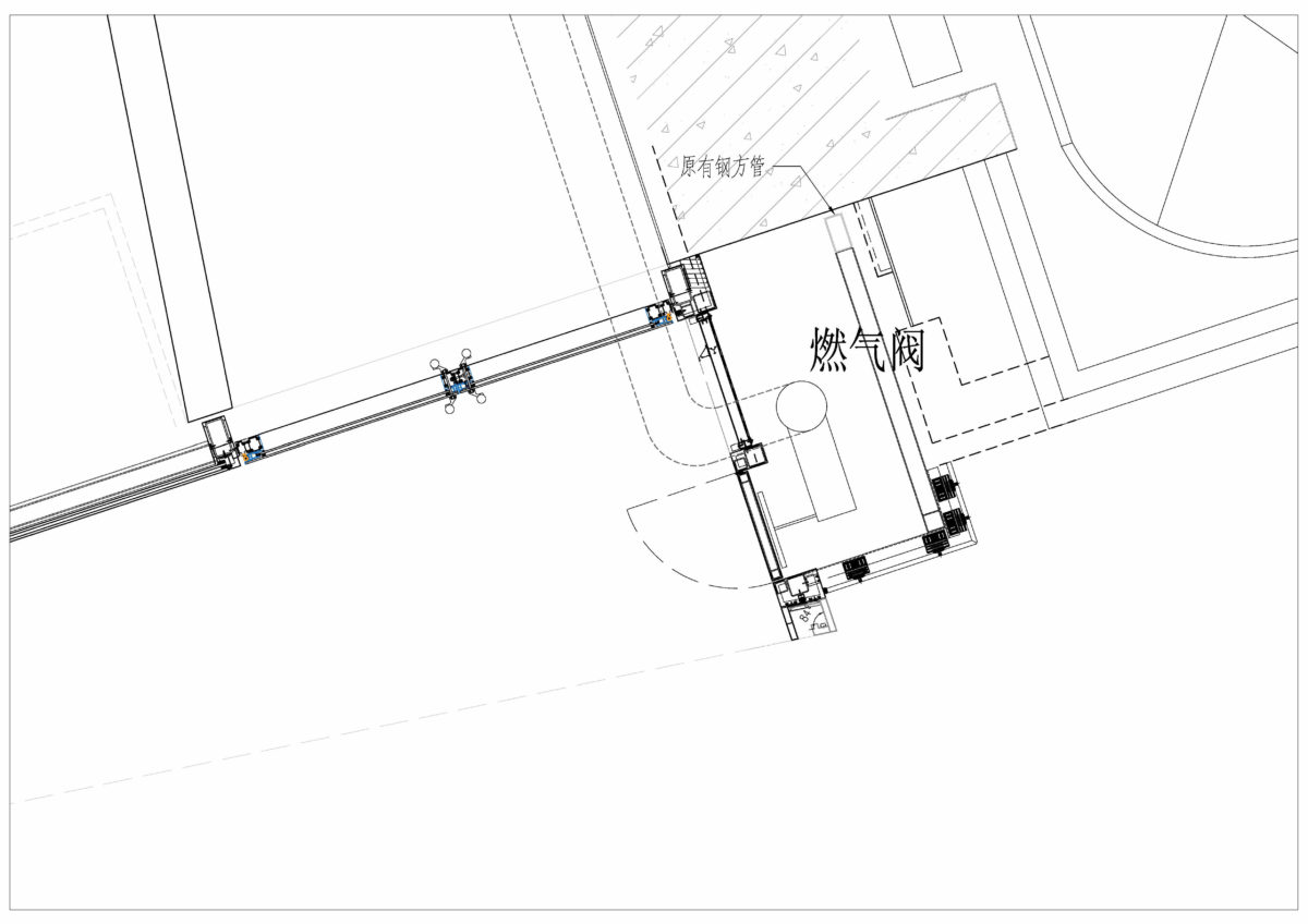
In the initial design, there was a prominent gas valve that could not be redirected or moved. To address this constraint, the head of the door was diagonally offset outwards, allowing for the gas shaft to be incorporated within the door frame. This design decision integrates and conceals the gas shaft, with the door opening positioned at the side, resulting in a unified and discreet design.
The city pulses, fashion breathes
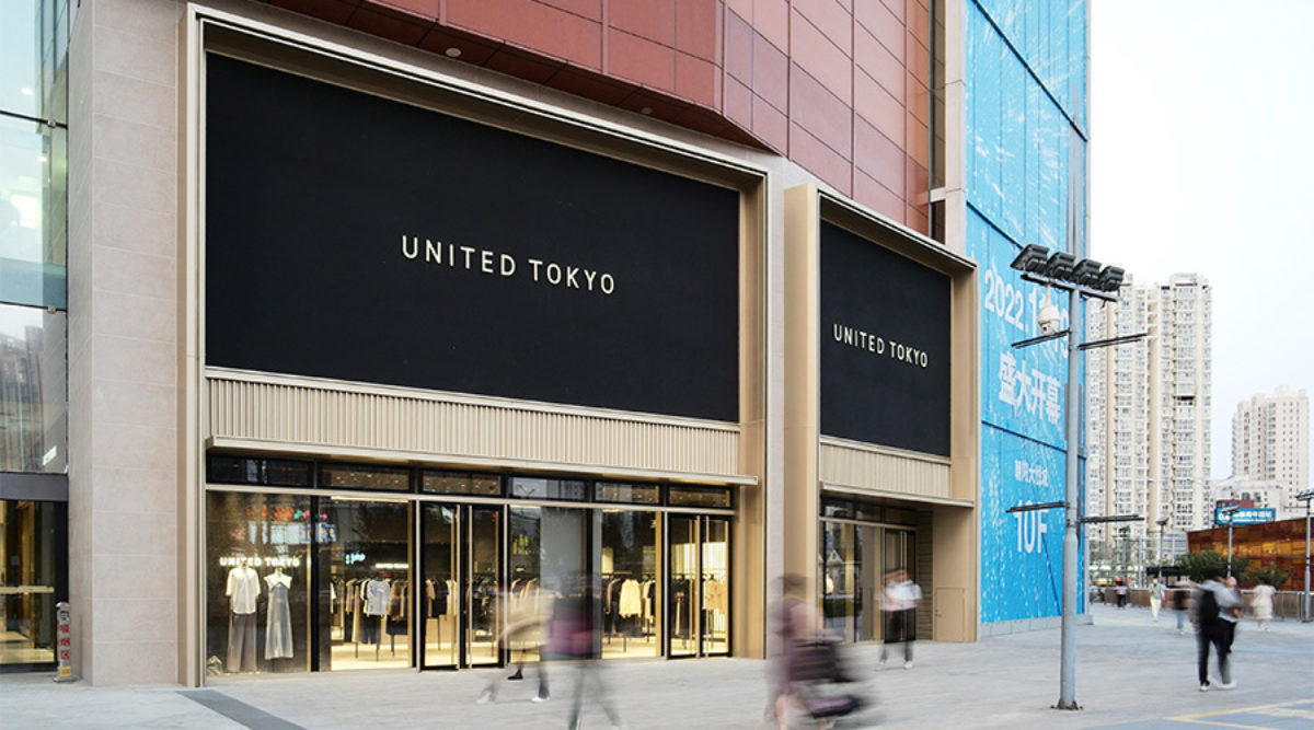
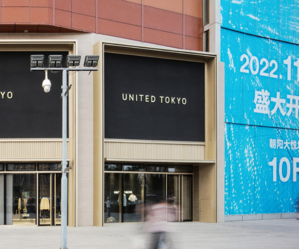
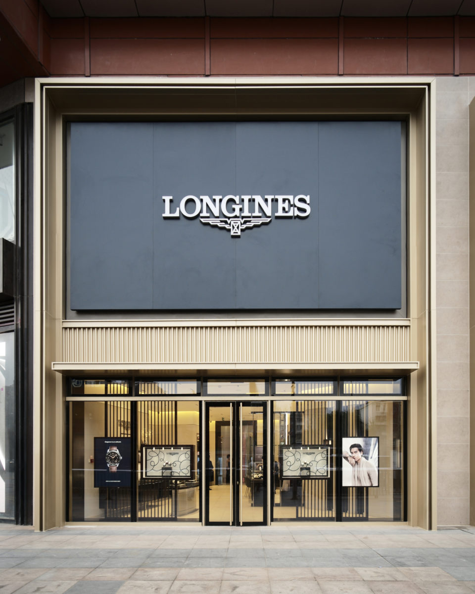
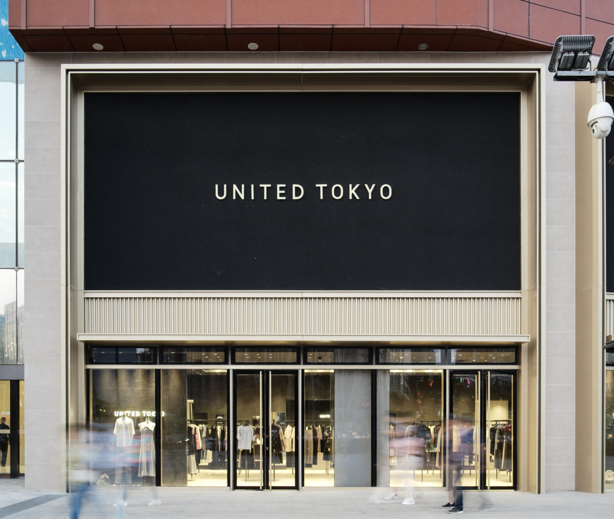
The design of the advertising space offers two options for shop owners to choose from. The first option involves using a solid board, as seen in the United Tokyo shop, which utilises a cement fibre board as the backing. This approach creates a simple and elegant appearance with the logo prominently displayed on top. The second option provides flexibility with removable metal panels on the left and right sides of the advertising space, enabling easy replacement of the banner content as needed.
Previously, the first two floors had a dark grey stone flooring with dark brown aluminium panelling. This colour scheme, however, resulted in a dark and sombre tone which did not align with the vibrant and trendy aesthetic of Joy City. To address this, the redesign opts for a lighter colour palette, combining light beige stone with champagne gold aluminium panelling to create a bright, warm, and inviting atmosphere throughout the space.
Joy City’s main entrance and first two floors of shops are set to undergo a significant transformation. The design aims to address the issues found in the existing entrance curtain wall, such as the inconsistent light levels and an outdated doorway that lacks distinction. Considering the existing structural limitations and construction feasibility, the final design will update the curtain wall while retaining the original curtain wall brackets and steel door frame structure.
The design plan entails replacing the glazing on the curtain wall, redesigning the entrance canopy, installing new glazing on the first floor to reduce sunlight penetration, adding small windows behind the curtain wall to ensure uniform light distribution within the space. Furthermore, the façade of the doorway will undergo a complete overhaul, creating a new retail landmark that caters to the preferences of Chaoqing’s Gen Z population.
Conclusion
As a prominent commercial complex in the heart of the city, the shopping centre’s image and brand play a crucial role in shaping consumers’ perception and impression of the city. The transformation and modernisation of Beijing Chaoyang Joy City’s façade extend beyond enhancement of aesthetics and style; they also serve to elevate the shopping centre’s brand value and influence. Through a commitment to ongoing innovation and refinement, the shopping centre aims to establish itself as a premier destination for young and fashionable individuals, injecting the Chaoqing business district with renewed energy and vitality.
Project overview:
Scope of services: Façade design
Category: Urban regeneration, redevelopment
Client: Grandjoy Holdings Group
Project area: Approx. 3000 m2
Principle project designer: Qin Pang
Project leader: Wei Tang
Project design team: Pengkun Wang, Xianbin Ni
