Strengthening a brand’s identity through bespoke retail design
Service
Planning, Concept, Schematic Design, and Design Development
Sector
Retail
Client
Canada Goose
Size
3,122 sq. ft.
Challenge
The two main challenges for this location were how to introduce a cold weather brand to a very hot climate; and how to personalize the store design, without compromising the brand’s core values and instantly recognizable global image, to make it part of a unique art community.
Solution
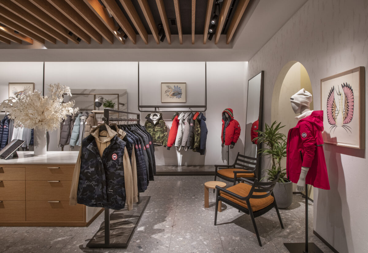
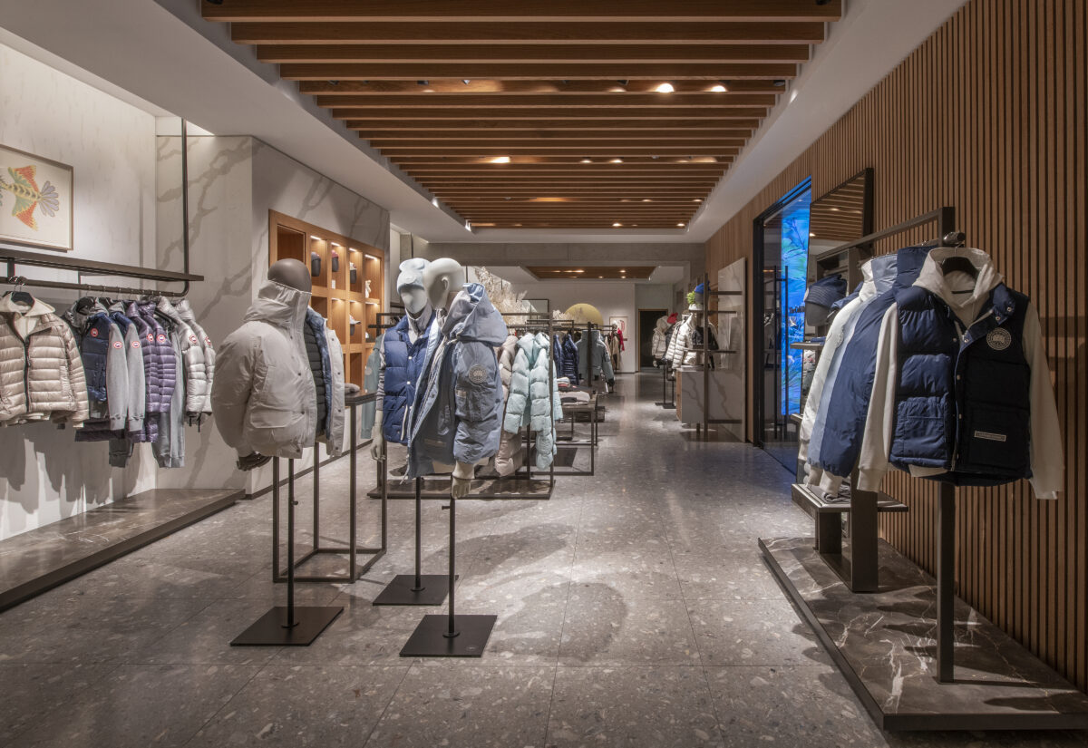
A new lighter, warmer, nature- inspired color palette was chosen. The unique exterior of slatted white oat was repeated inside as a wood baffled ceiling to create a cozier feel. The semi-closed window displayed merchandise stories with a direct view into the “snow room” located at the front of the showroom. The walls are venetian plaster finish with terrazzo while the wood floors define each lifestyle zone of men’s, women’s and kids’ apparel. Calcutta marble and white quartz represent the Canadian cold but wood was purposely used more in the store to provide the Canadian warmth. A soft archway with a sunset glow affect is the entryway into the back where the merchandise is prepped for customers. New indigenous southwest wall art from local artists was added to celebrate community and culture.
Result
The Canada Goose recognizable image was successfully translated into a one-of-a-kind location. Some of the unique design details are now being applied to future store designs where you can still celebrate the brand ethos embracing the cold while experiencing it within a warmer,cozier environment.

