CORE
Calgary, Canada
A downtown staple lets the outside in.
Service
Planning, Concept, Schematic Design, Design Development, Tenant Design Criteria, Tenant Design Reviews, Brand Identity, and Signage & Wayfinding
Sector
Mixed-use
Client
Cushman & Wakefield
Size
600,000 sq. ft.
Challenge
Our client wanted a cohesive identity for three physically connected yet aesthetically unrelated buildings in the heart of Calgary’s business district. Intuitive accessibility to upper levels 3 and 4 led to chronic tenant vacancies. As a result, while residential and office tower density was increasing, central growth stagnated.
Solution
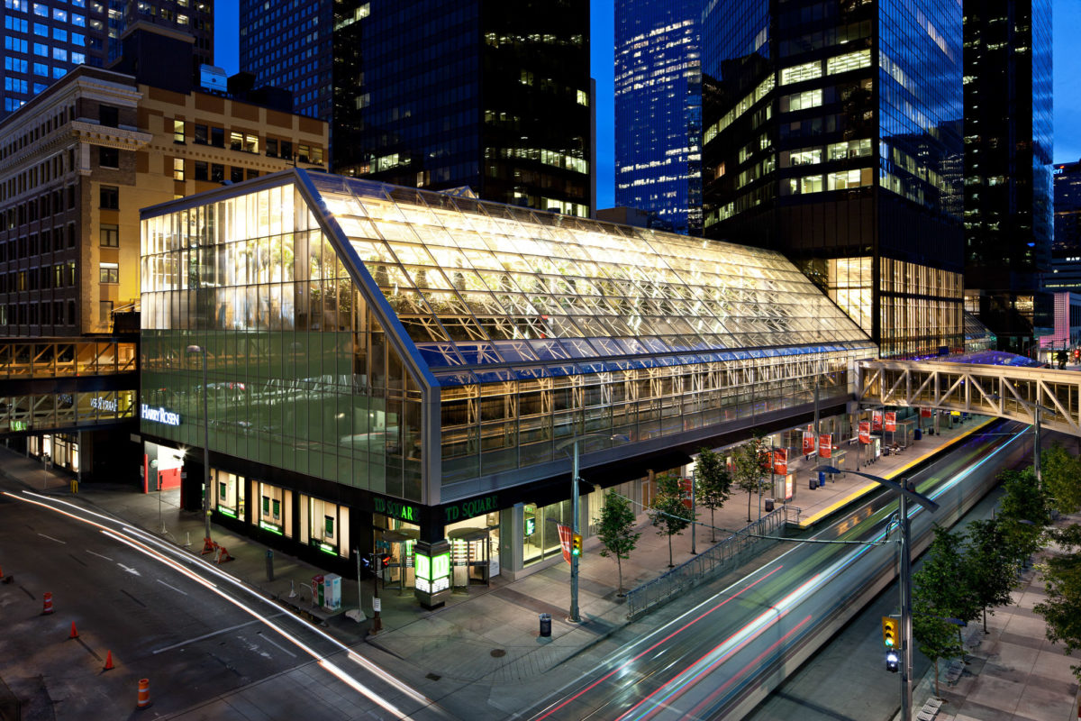
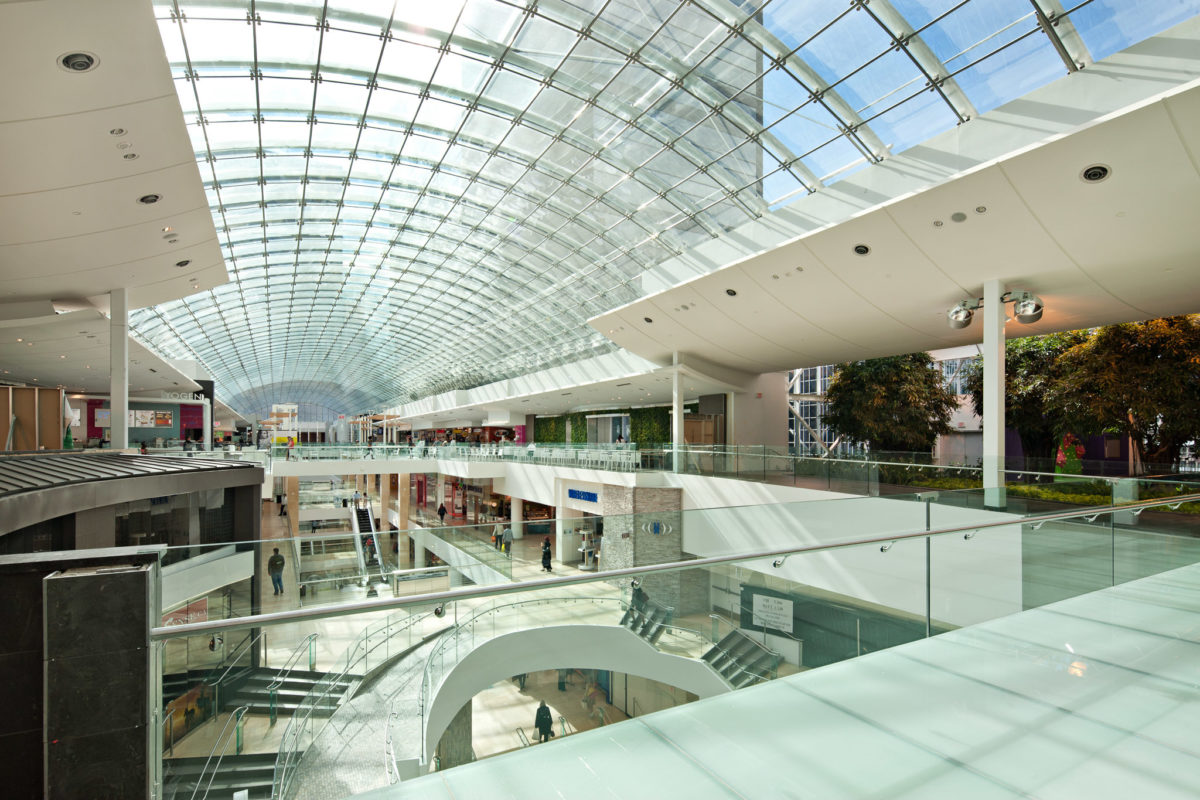
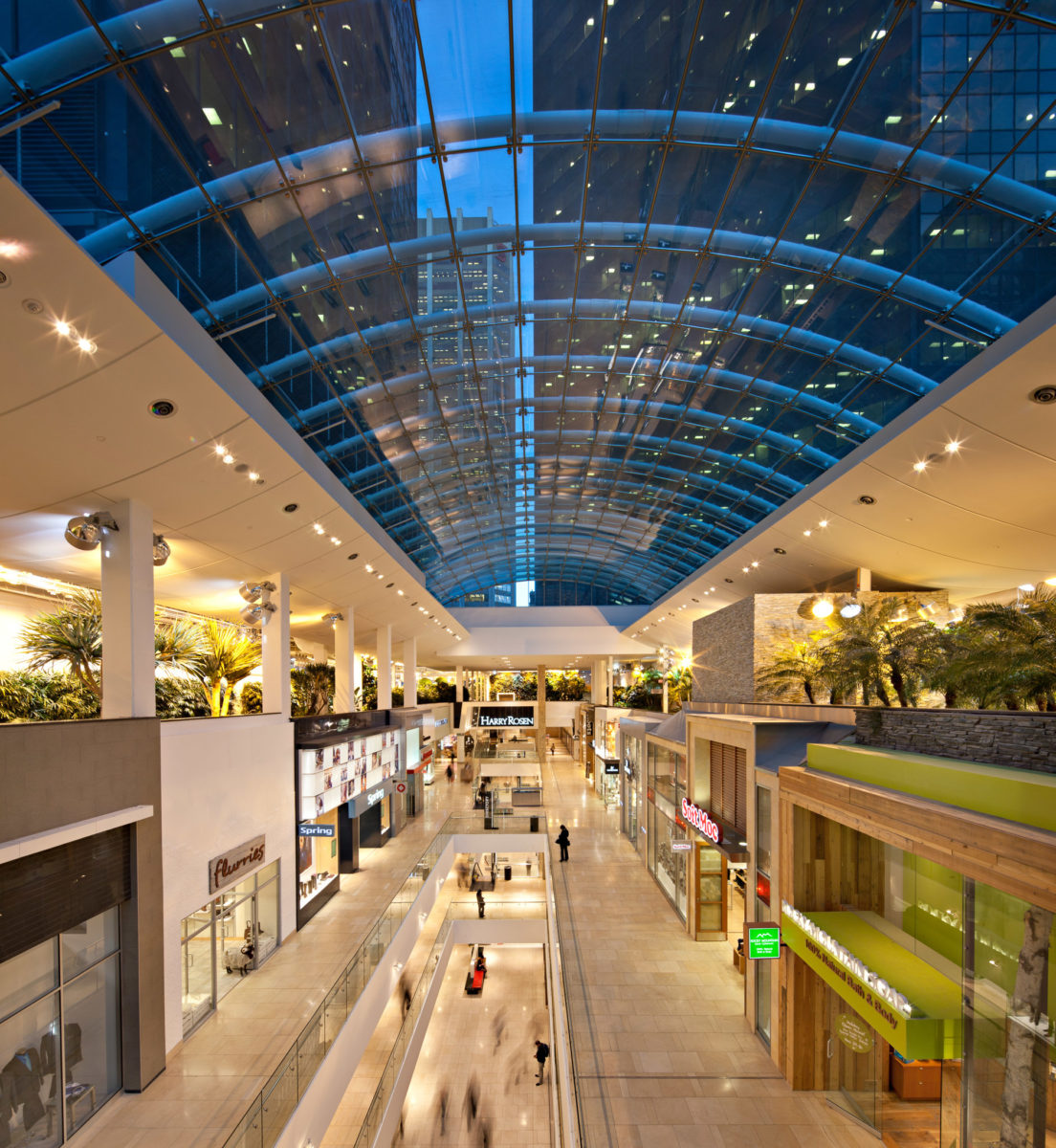
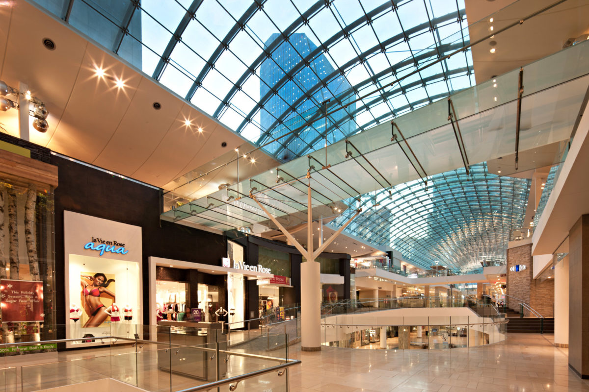
We began by improving sightlines across all levels to increase retailer visibility. We relocated escalators, widened concourses, opened floor slabs and added a glass pedestrian bridge to link opposite sides of the property. We also removed a range of obstacles to reveal the full splendour of an expansive upper-level garden.
Result
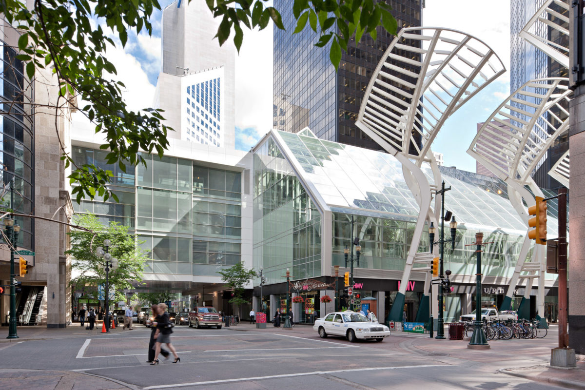
An ambitious urban renewal project sees previously disjointed entities integrated into a single multiuse complex. Under a canopy of structural glass, visitors revel in a vibrant streetscape awash with natural light, with soaring 1.5 storey façades and a progression of dynamic storefronts – a visually rich and immersive retail experience.
