Creating urban positivity
Service
Placemaking
Sector
Retail
Challenge
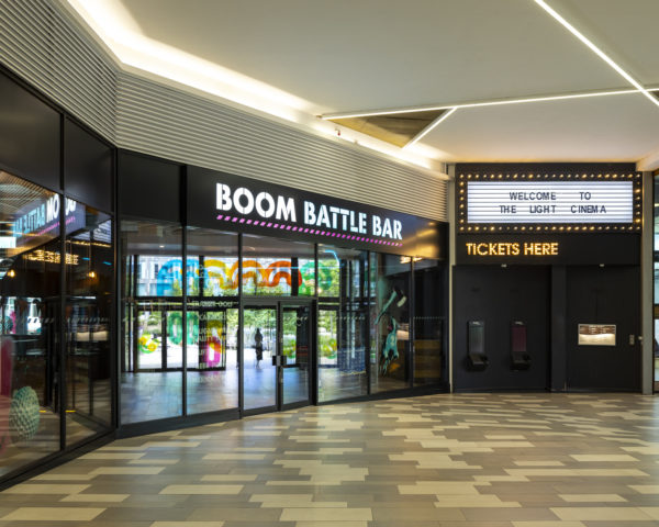
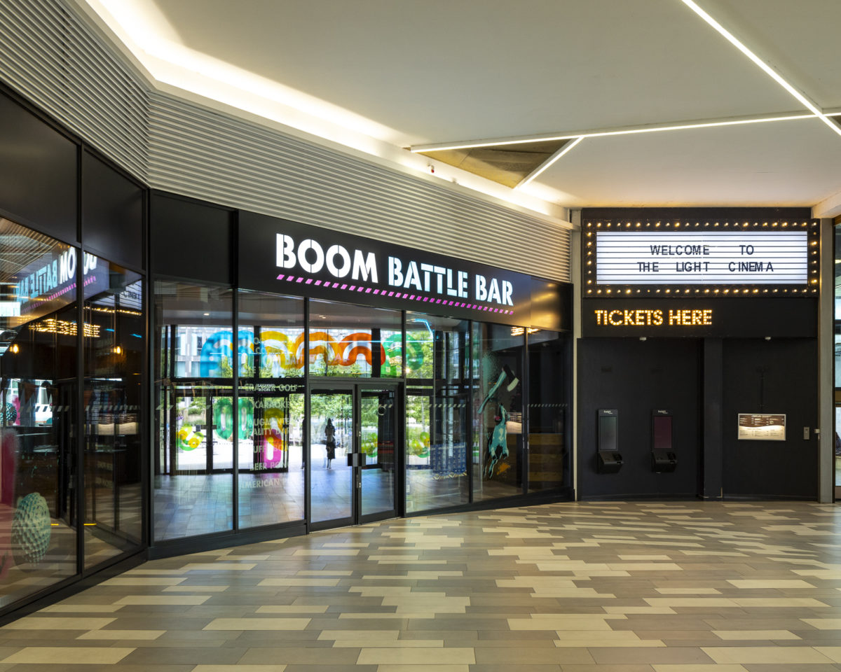
Rebuilt in the 1950s, The Moor is Sheffield’s main pedestrianised shopping centre, home to an array of tenant retailers and restaurants. The Light cinema complex, with its adjacent F&B offerings, is a major feature of the quarter, but in recent years has suffered from a lack of visibility and footfall. Building landlord NewRiver REIT, with support from investors PIMCO, wanted to bring this space to life and create a meaningful new destination for the city.
Solution
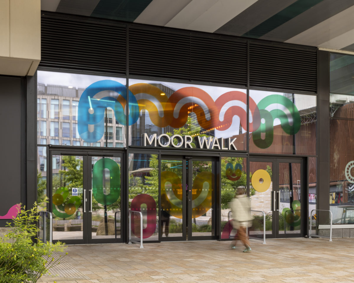
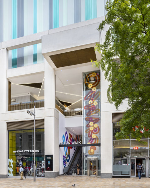
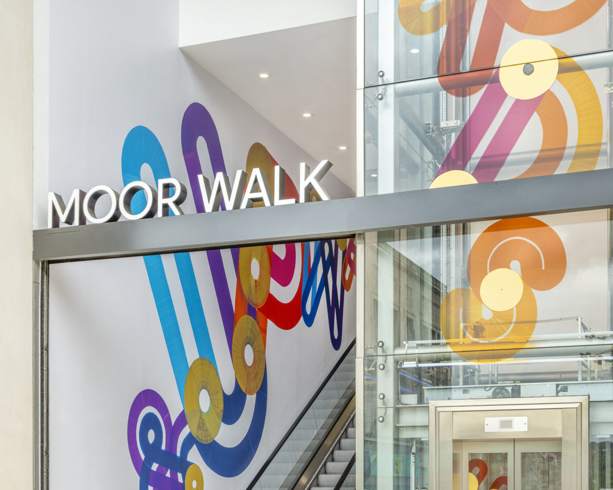
Challenged to devise a placemaking solution for this central urban asset, we undertook a rigorous assessment of the building and surrounding public realm. Seeing that the internal offer was hidden and the entrances hard to find, the team decided to leverage the building’s cut-through – with escalators on one side, walkway on the other – to create a sense of place. First, they addressed the navigational aspects of the scheme, believing that in order to create a destination, they needed to conceive a name. After brief deliberation, they settled on Moor Walk, which aims to encourage access to the building and the space within. Internally illuminated aluminium lettering would spell out the name above each entrance, creating a highly visible destination and meeting point for pedestrians. The team also created backlit wall-mounted tenant boards to highlight the internal retail and F&B offerings, boosting street-level exposure and engagement.
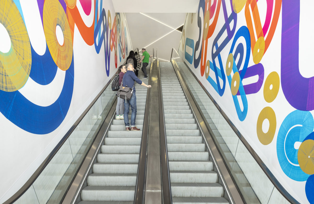
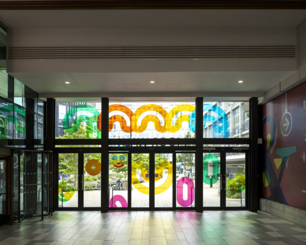
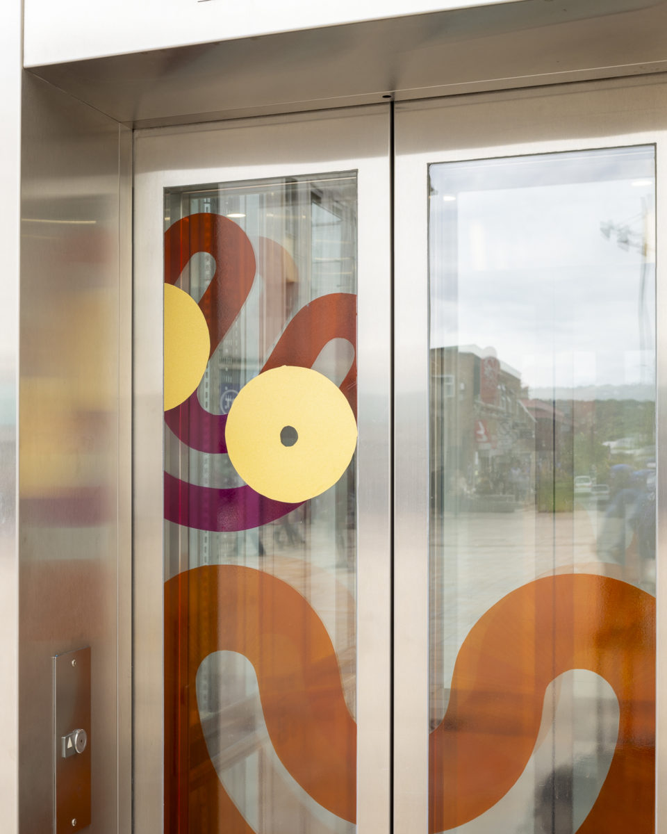
Next, we sought a creative activation strategy that would inject dynamism, excitement and colour into the project. And for this, they sought the help of graphic artist and typography specialist, Dave Towers. Dave works with wide-nibbed graffiti pens that come in three different widths, creating letterforms using bright, bold colours, often with a rich distorted texture. He’s also known for his positive phrasing and wordplay. Above all, it was thought that the raw textural quality of Dave’s work, his almost mechanical typographic forms, would resonate with Sheffield’s industrial past.
Result
Working closely with Dave, we explored different letterforms and phrasing for the available space. They landed on the phrase ‘onwards & upwards’, which conveys both the upward motion of the escalator and a sense of urban renewal. This message, combined with playful graphic elements and a bright neon acrylic colour palette, aimed to provide a powerful counterpoint to the retail doom and gloom of recent years. The word ‘upwards’ is also presented in large tumbling letterforms, which appear to be falling backwards down the Moor Walk escalator. This element of graphic wit, plus the warmth, imperfection and playfulness of the typographic design, makes the artwork accessible and human. Now live, the project has created a vibrant destination in the heart of Sheffield’s shopping district; a bold combination of placemaking and public art, whose upbeat visual presence is compelling pedestrians and passersby to stop, look and step inside.