Redefining an iconic gallery
Service
Wayfinding
Sector
Culture
Client
Wellcome Collection
Challenge
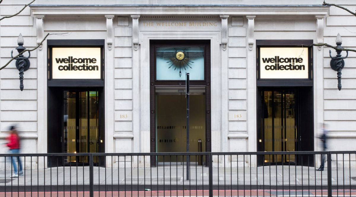
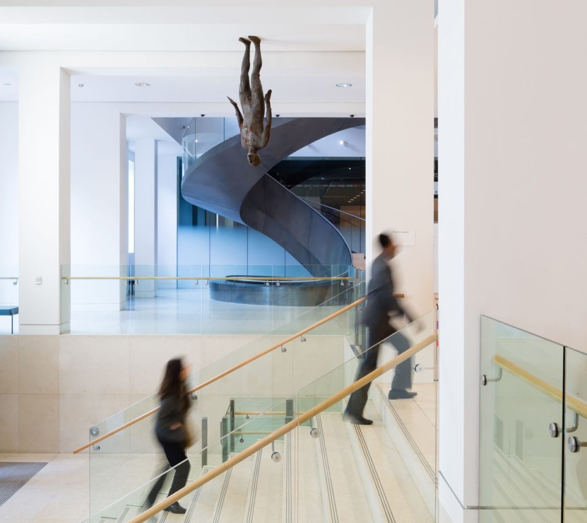
Wellcome Collection’s newly expanded galleries called for a wayfinding strategy and interior concept design. A timeless scheme was required to enhance navigation and reflect the transparency of the Wellcome identity.
Solution
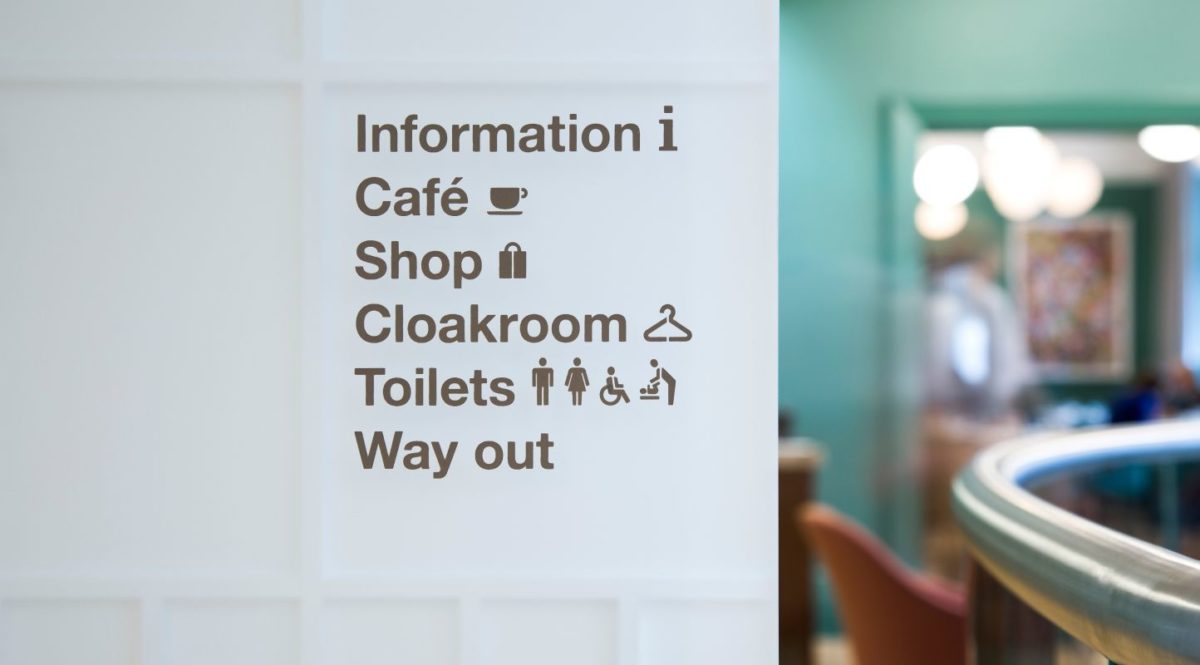
Creating grid-based modules to express the brand three-dimensionally, we developed signage products that integrate seamlessly with the new and old architectural finishes. We also migrated all changeable information to digital entrance screens, ensuring the longevity of the fixed wayfinding features. The signs themselves are robust and recyclable, and clearly distinguishable from marketing through the use of neutral colours. The result is a scheme that eloquently articulates the Wellcome brand through product.
Result
The project is now live and is shortlisted for an IIID Award for Wayshowing.


