Uniting campus components through materiality and detailing
Service
Graphic Design + Wayfinding
Sector
Education
Client
University of Winchester
Challenge
A confident sign scheme that challenges convention while articulating and reinforcing core institutional values.
Solution
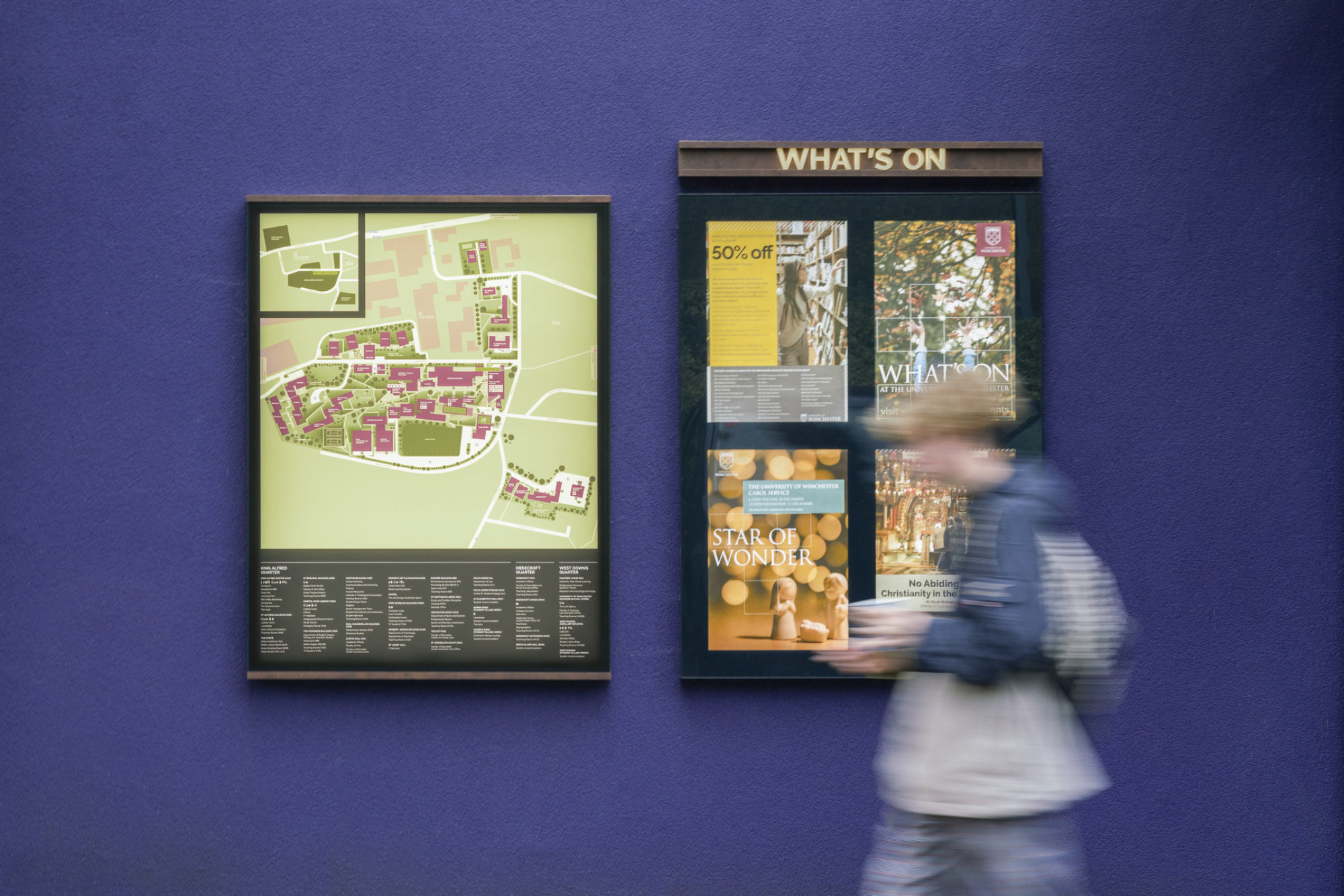
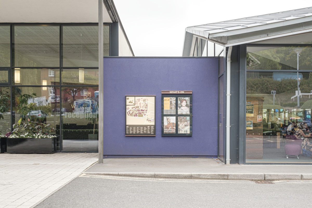
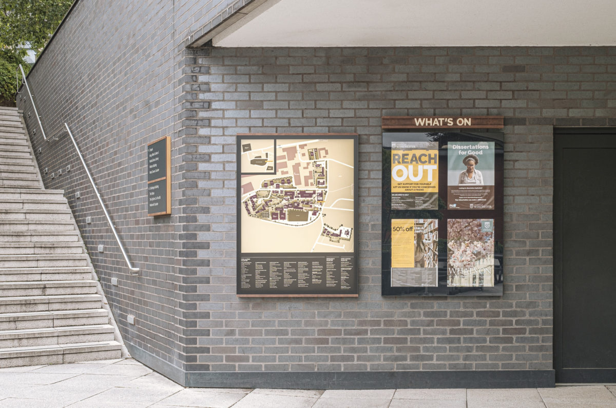
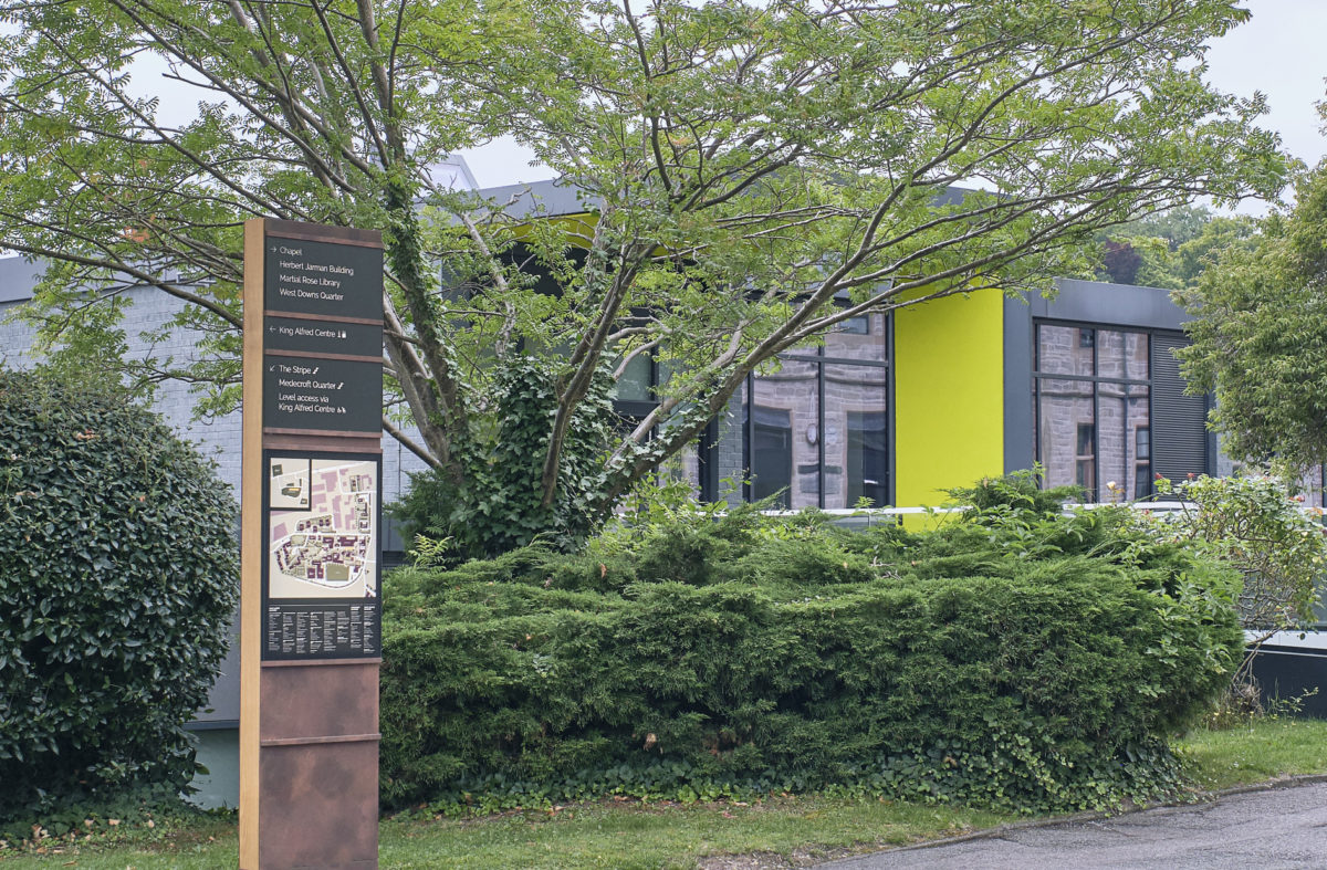
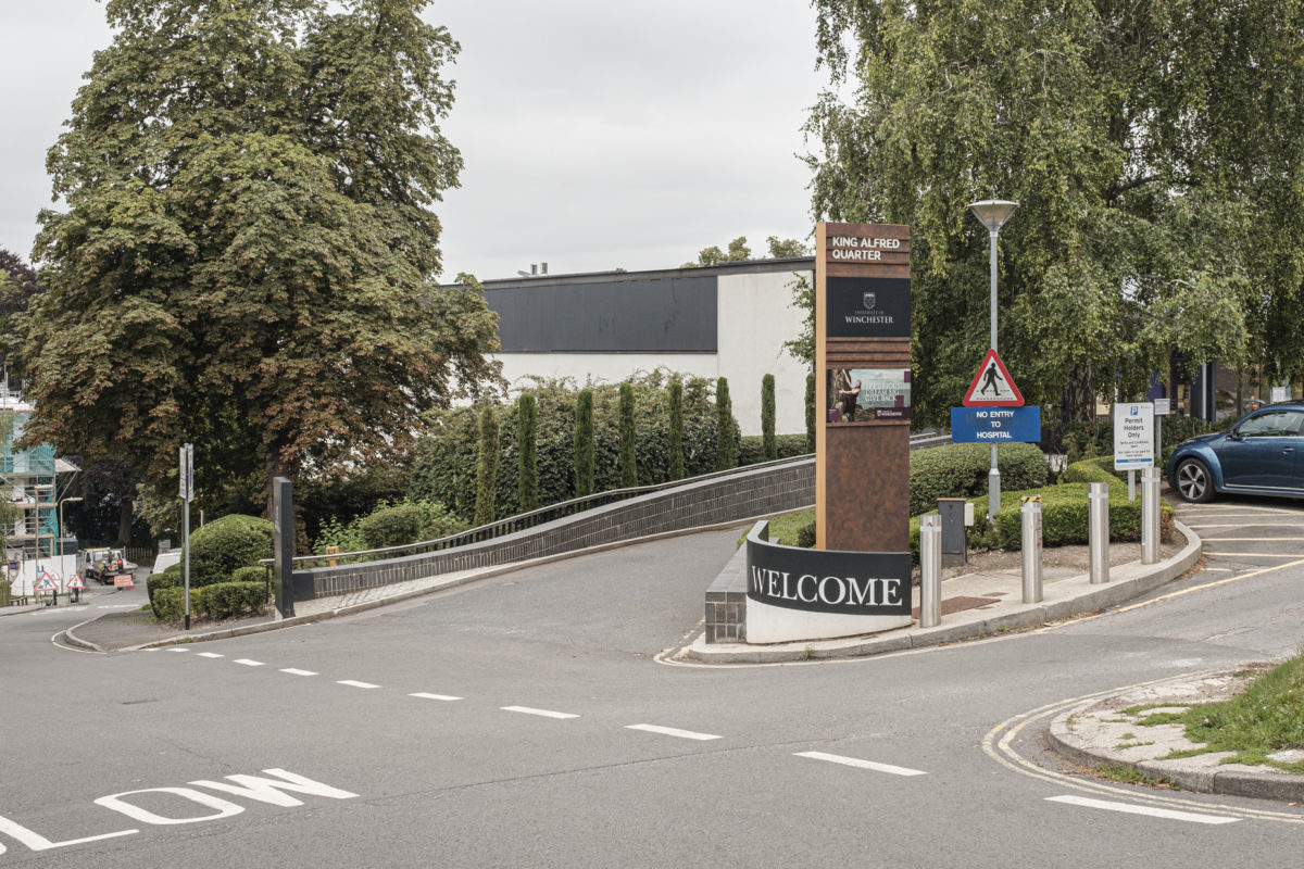
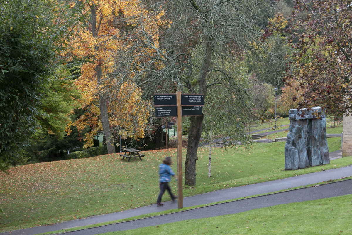
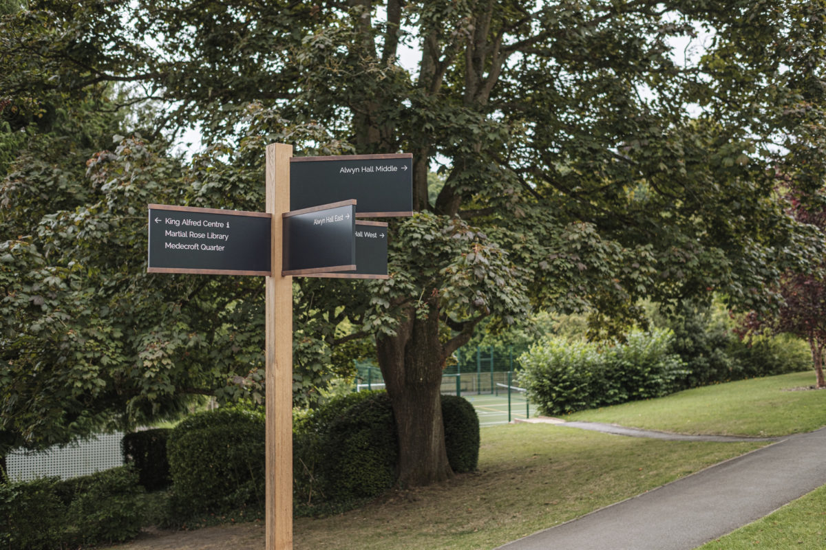
The University of Winchester wanted a wayfinding scheme to help unite multiple campus components. The scheme needed to challenge convention, promote flexibility, and articulate the university’s core values. Focusing on materiality, product design and typography, our design takes inspiration from the ‘lateral’ architectural details found on the university’s old and new buildings. A flexible sign structure supports the required content and allows for easy updates, while balancing a contemporary Corten steel finish with ancient stonework. The result is a clear, confident sign scheme that sits elegantly within this historic setting, creating a sense of wellbeing, connection and calm for the university’s multiple users.
Result
Project is now live.
